Smart
Budgeting
Made
Simple.
PROBLEM
Many budgeting apps overwhelm users with feature-heavy interfaces, making it difficult to understand spending or build consistent financial habits.
SOLUTION
Nest is a mobile budgeting app designed to simplify how users track spending, build savings, and develop consistent financial habits through clear insights and goal-based design.
OUTCOME
The final product simplifies key financial flows, giving users clearer visibility over their spending and helping them stay accountable to their goals.
KEY INSIGHT
Users didn’t need more features - they needed clearer, more actionable visibility into their spending.
Nest helps users gain clarity and control over their finances through simple, habit-building interactions and clear visual feedback. Through research, ideation, and prototyping, I designed a simple, habit-building experience that empowers users to track spending, create goals, and stay accountable - without the overwhelm common in traditional budgeting tools.
From initial research through to high-fidelity prototyping, I led the end-to-end product design process, facilitated ideation sessions, and delivered a functional, user-validated design system and experience.

02
PROBLEM
Managing money is consistently one of the most stressful aspects of adult life.
What users told me:
01
Struggle to track where money goes
02
Feel overwhelmed by complex budgeting apps
03
Want a simple way to build savings habits
04
Avoid budgeting because it feels “too hard” or “too boring”
SYNTHESIS
Users don’t lack access to financial tools - they lack clear, simple ways to understand and act on their spending.
DESIGN CHALLENGE
How might we create a budgeting experience that feels simple, supportive, and confidence-building -- not stressful or complicated?
03
RESEARCH
Setting the preliminary research goals.
To better understand spending behaviours and financial pain points, I conducted 5 user interviews and a survey with 20 participants. This research was supported by competitor analysis, persona development, and journey mapping to uncover patterns in how users think about and manage money.
Who Are My Users?
+
Key Problems & Needs
+
What I Wanted To Learn
+
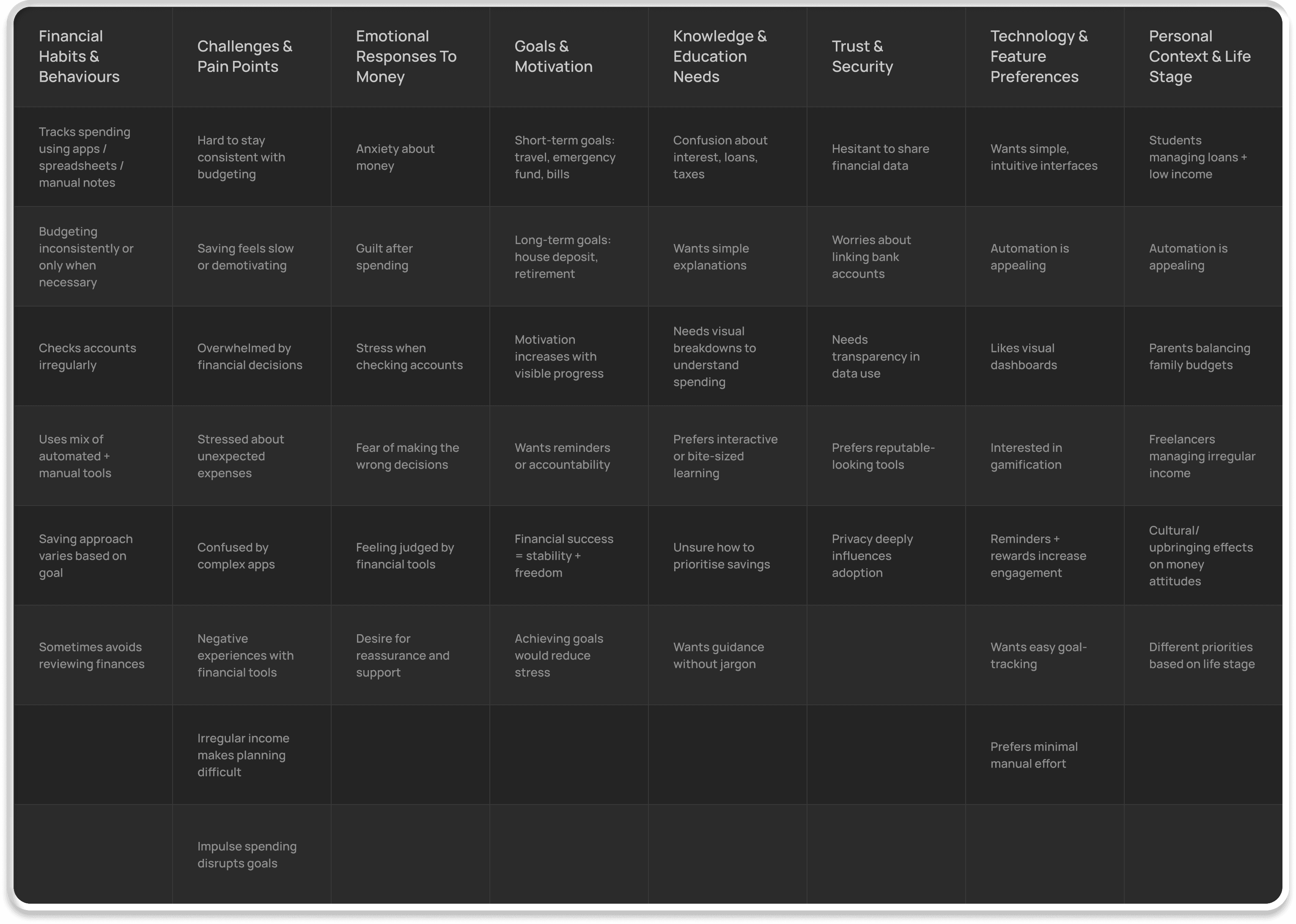
INITIAL RESEARCH /
AFFINITY DIAGRAM
[ORGANISED CLUSTERS]
Identifying key pain points and opportunities.
I organised insights from interviews and surveys into an affinity map to uncover common behaviours, frustrations, and needs. This helped reveal core pain points and clear opportunities to guide the product direction.
Key Pain Points
+
Opportunities Identified
+
Insights from competitive audit.
I conducted a competitive feature analysis and supporting desk research to understand the current landscape of budgeting and savings tools. While no existing product fully aligned with the design goals, the audit revealed a range of adjacent solutions, patterns, and opportunities worth leveraging.
This analysis helped highlight what competitors do well, where they fall short, and where our product can create meaningful differentiation for users.
Research Findings
+
Analysis & Key Opportunities
+
Summary Of Findings & Next Steps
+
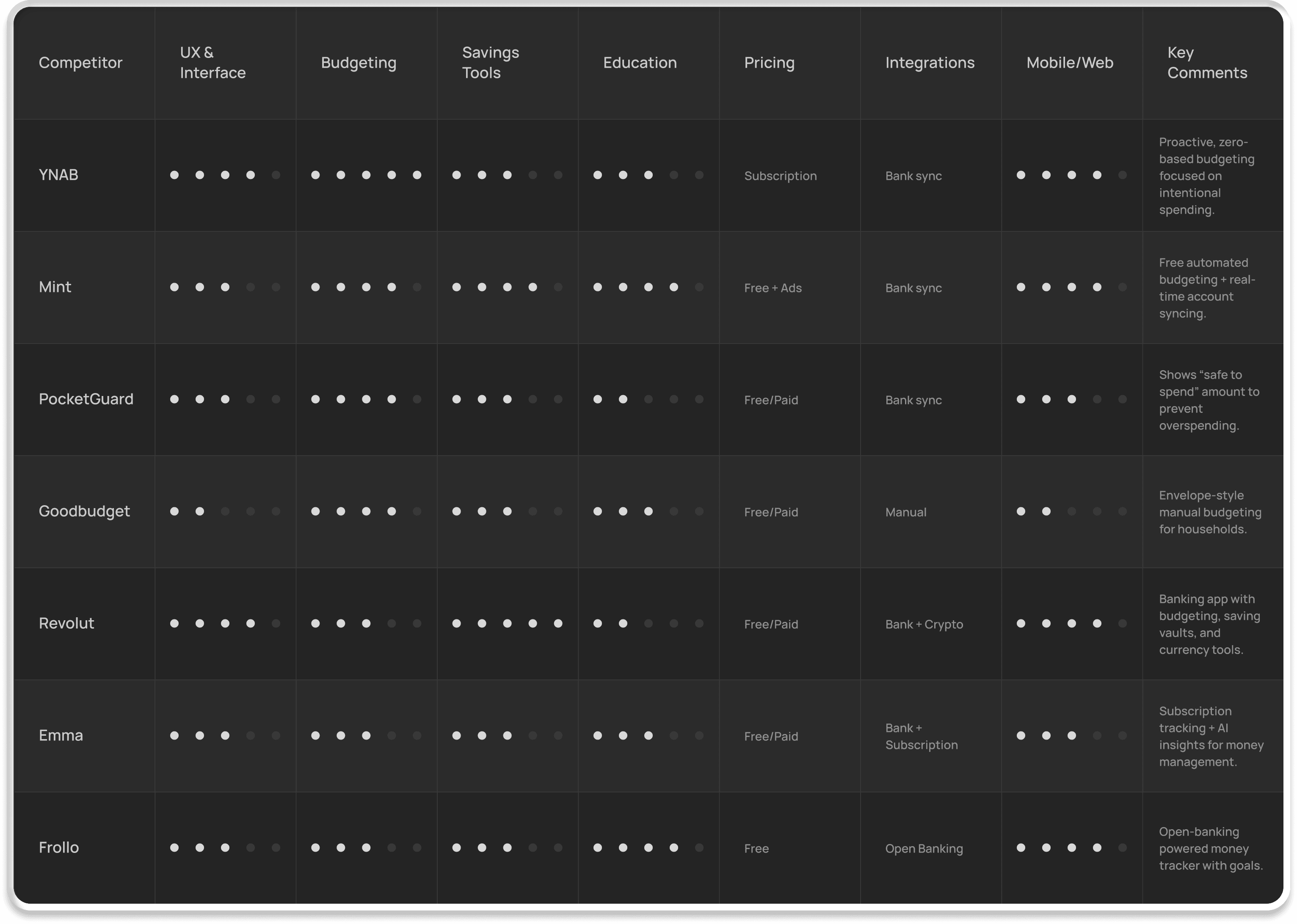
INITIAL RESEARCH /
COMPETITIVE AUDIT COMPARISON TABLE
RESEARCH SYNTHESIS
04
DEFINING THE USER
Primary Persona: Liam Thompson
To ensure the product aligns with the needs of real users, I developed five personas during the research phase. After evaluating their goals, behaviours, and financial challenges, I selected Liam Thompson - a recent graduate and junior civil engineer - as the primary user for this case study.
Liam represents a large segment of young adults who are new to managing their finances independently and need simple, confidence-building tools to start budgeting and saving effectively.
Who Is Liam?
+
Liam’s Goals & Frustrations
+
USER STORY
“
As a recent graduate, I want to easily track my small recurring expenses and manage my budget, so that I can save for a new car and repay my student loan without feeling overwhelmed.”
USER RESEARCH /
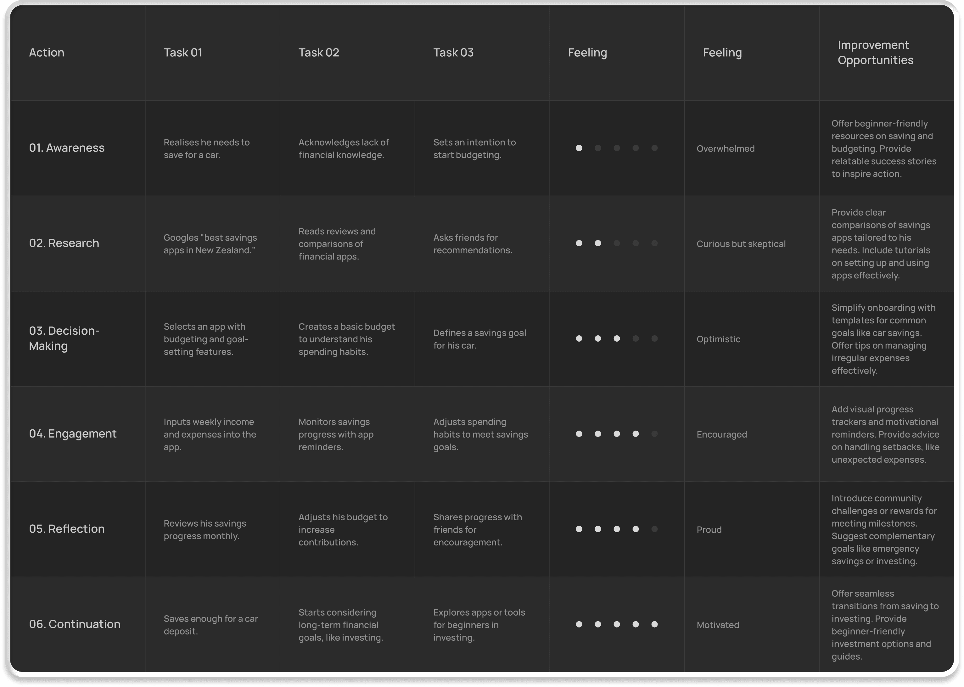
USER JOURNEY MAP
Understanding the user’s journey.
Liam’s financial journey moves from feeling overwhelmed and unsure where to begin (awareness), to cautious exploration (researching apps and beginner financial tools), to optimism (choosing a budgeting tool and setting his first goal), and finally to pride and motivation (seeing progress toward buying a car).
However, unexpected expenses, irregular spending habits, and a lack of financial knowledge create setbacks, causing frustration and highlighting the need for clarity, structure, and ongoing support.
Key opportunities identified:
01
Help beginners build financial confidence
02
Reduce friction in tracking small recurring expenses
03
Provide flexible budgeting tools for inconsistent spending
04
Support long-term habit building with insights
USER RESEARCH /
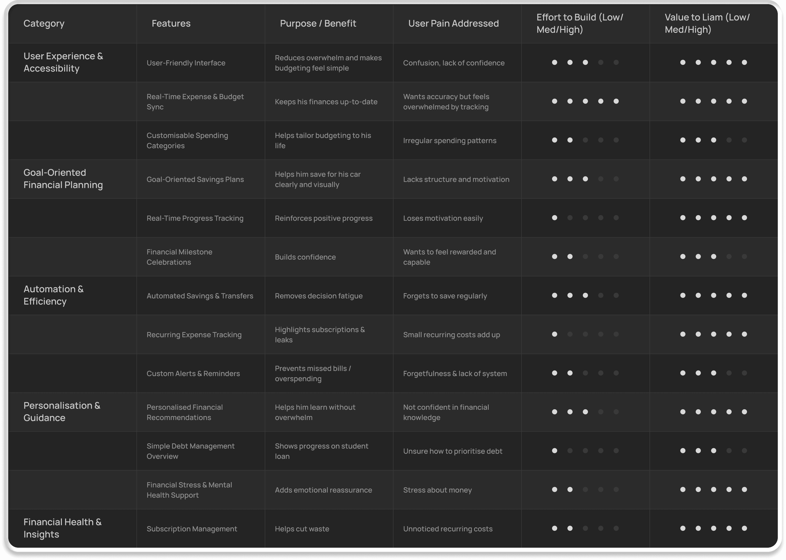
FEATURE PRIORITISATION MATRIX
PROBLEM STATEMENT
Liam needs a simple and adaptive way to manage his budget and save for a car.
He often feels overwhelmed by financial tools that don’t match his irregular spending habits or his developing financial confidence. A more supportive and flexible system is required to help him stay on track without added stress.
HYPOTHESIS STATEMENT
If Liam uses a budgeting tool designed for irregular spending and simple goal tracking, he will build confidence and better financial habits.
By reducing complexity, automating key tasks, and visualising progress toward goals like purchasing a car, the tool can help Liam feel more in control of his finances and maintain consistent savings without feeling overwhelmed.
Most Important Features For Liam
+
05
IDEATION
Exploring design ideas with a focus on the user.
During ideation, we explored multiple approaches to solving Liam’s core problem: building better financial habits and saving for a car despite irregular spending patterns. We used visual thinking and brainstorming techniques to generate diverse ideas.
Techniques Used
+
Key Ideas That Emerged
+
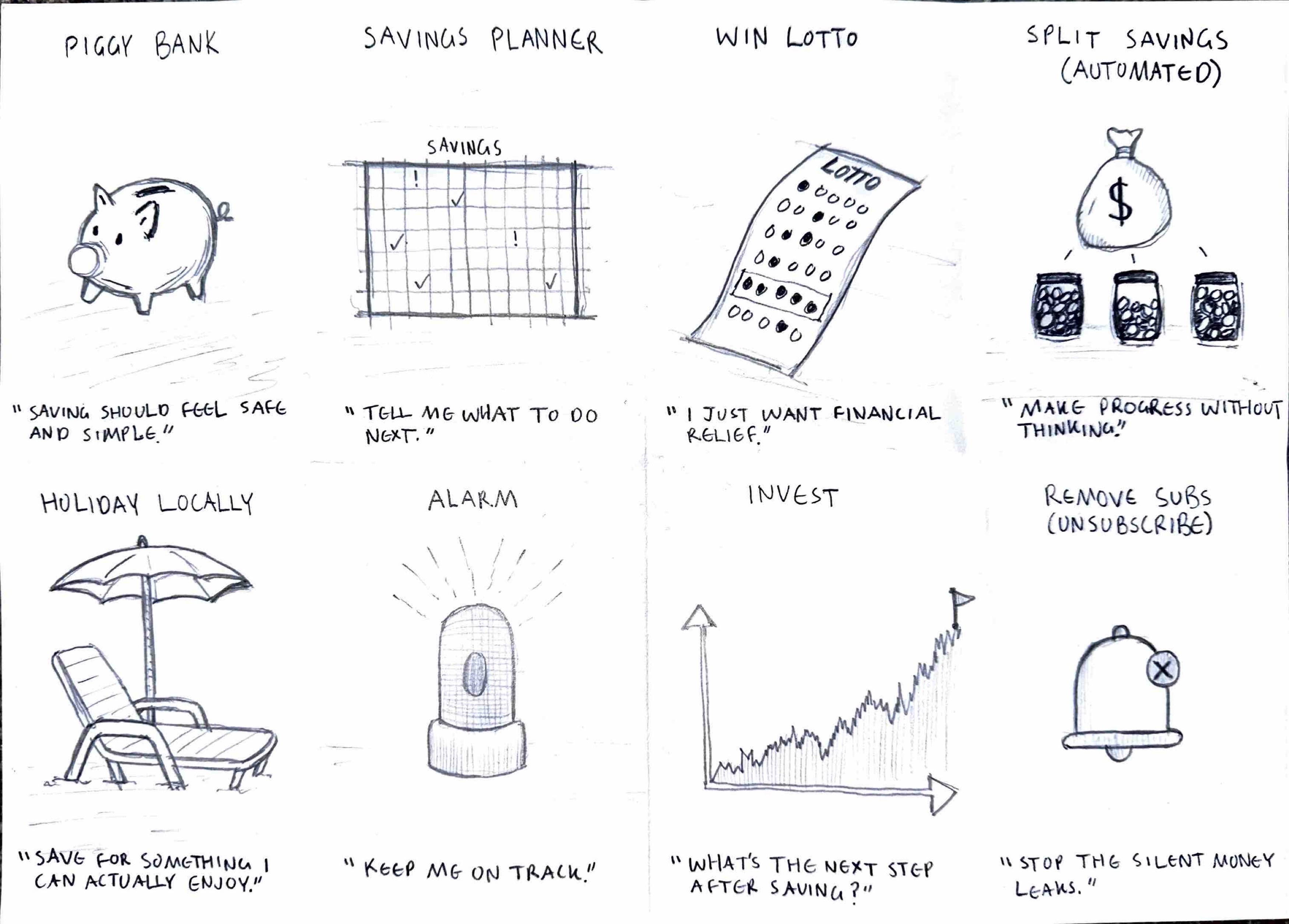
DESIGN IDEATION /
CRAZY 8’S
GOAL STATEMENT
The app helps Liam track income, expenses, and student loans so he can build stability and save confidently for a new car.
Liam needs a simple, guided tool that reduces overwhelm and helps him build healthier spending habits.
By clarifying cashflow and supporting consistent saving, the app reduces uncertainty and helps Liam stay on budget. Success is measured by his ability to consistently grow his car savings and stick to his planned budget.
Establishing the overall design ideas.
The ideation phase turned insights about Liam into focused design directions, prioritising high-impact, feasible features to support his goal of saving for a car despite irregular spending.
This section presents the key design ideas from brainstorming and how they were prioritised into an MVP, with potential for future features.
MVP -- Core Essentials For Launch
+
DESIGN IDEATION /
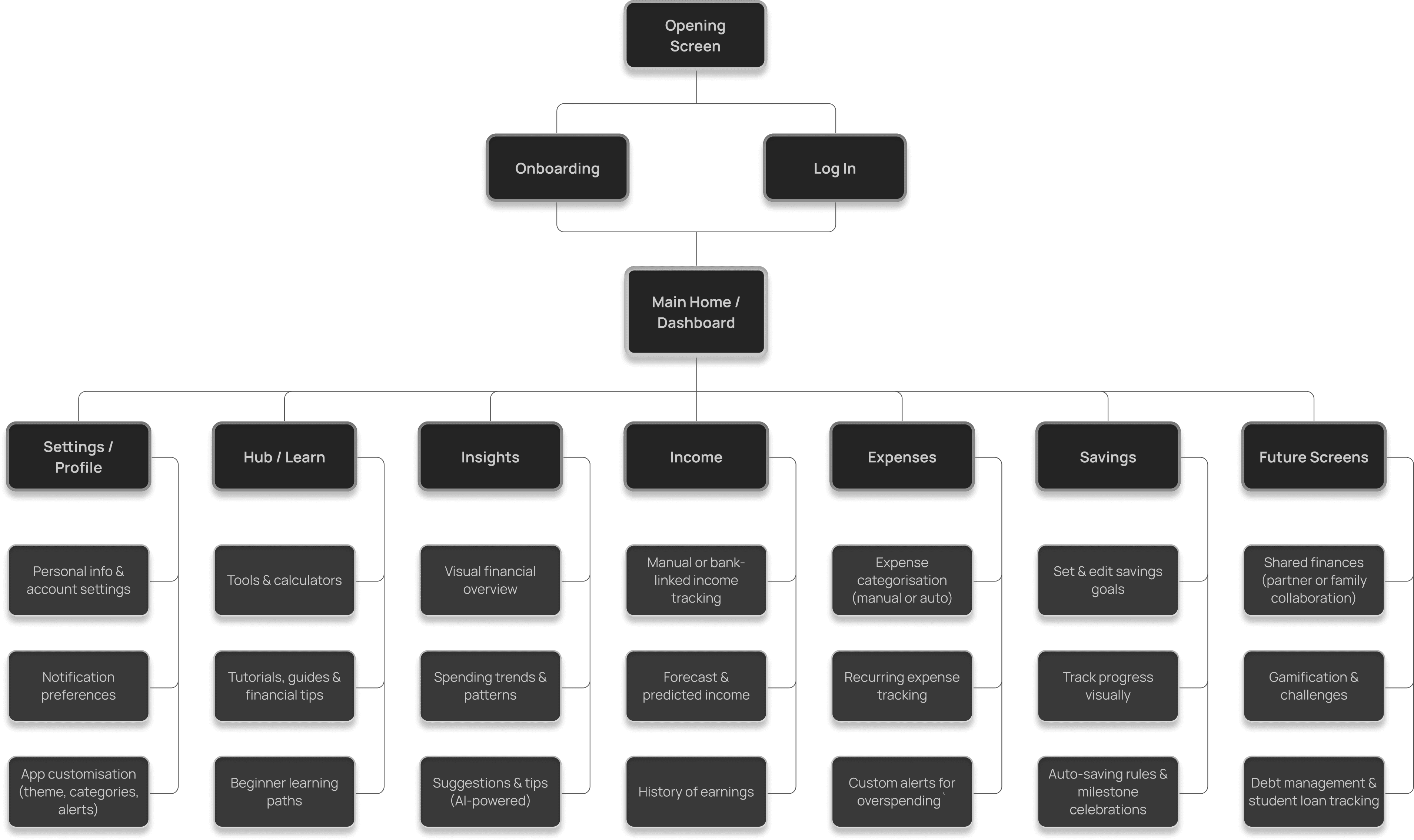
INITIAL INFORMATION ARCHITECTURE
06
WIREFRAMING
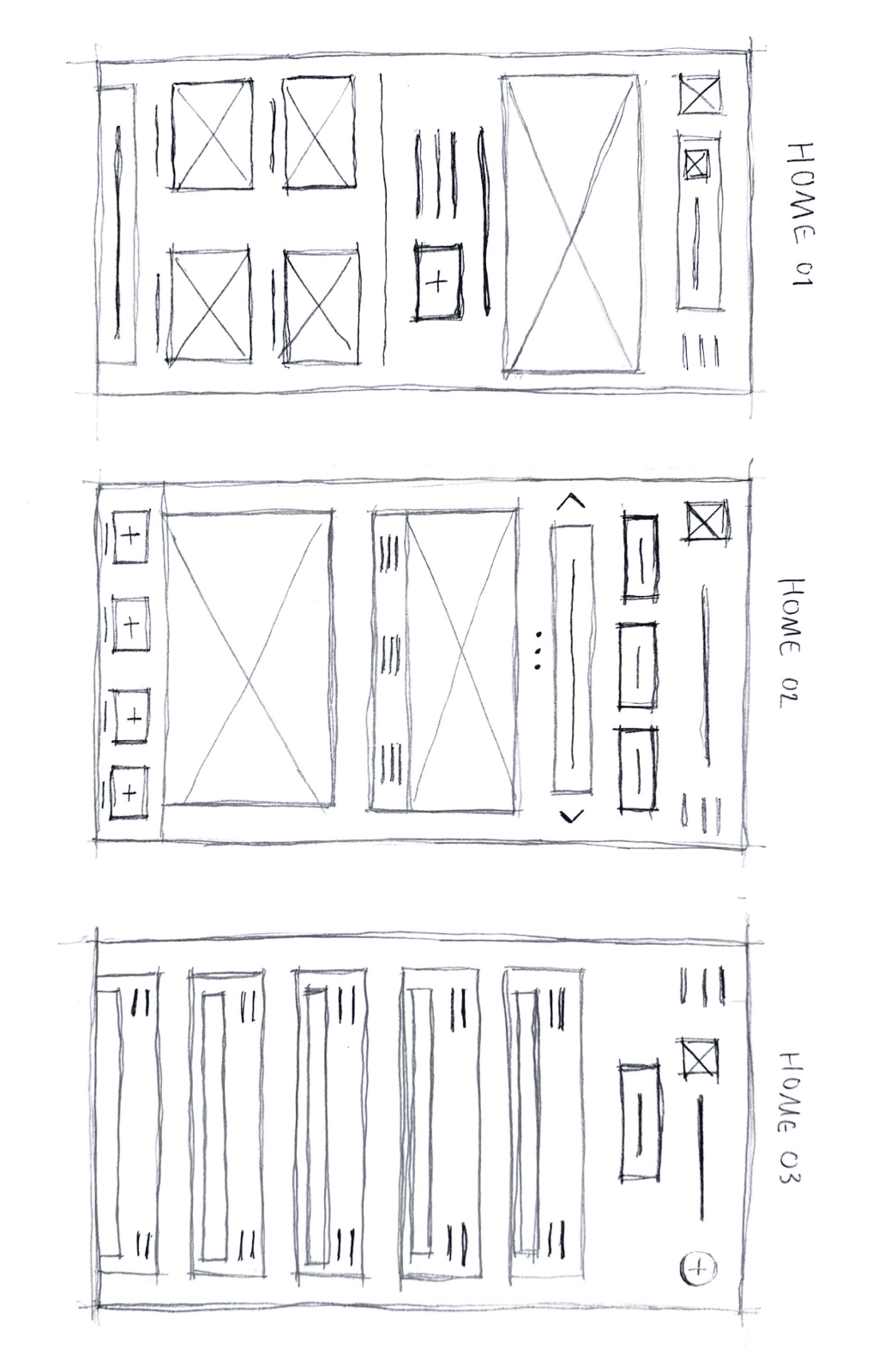
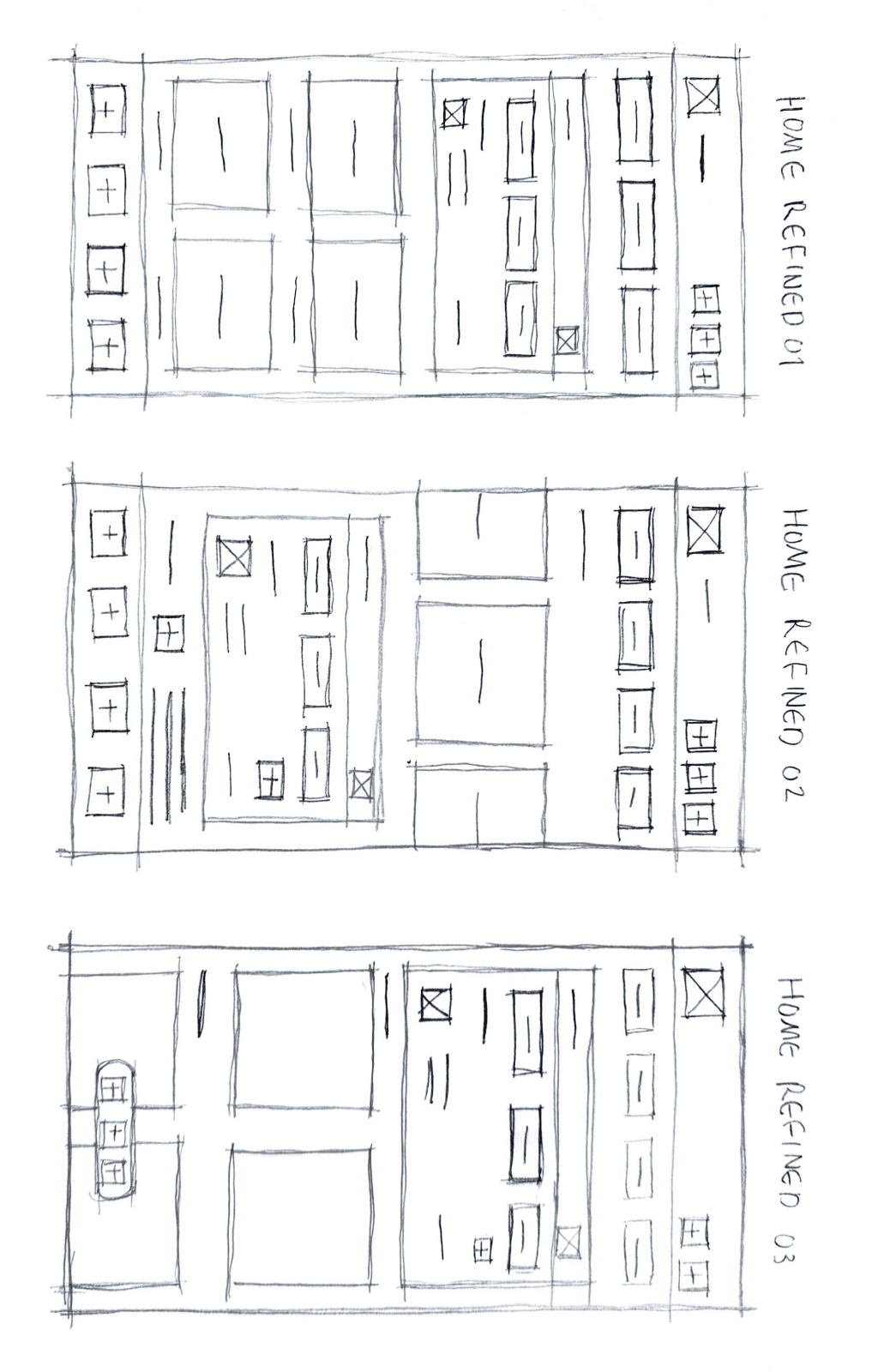
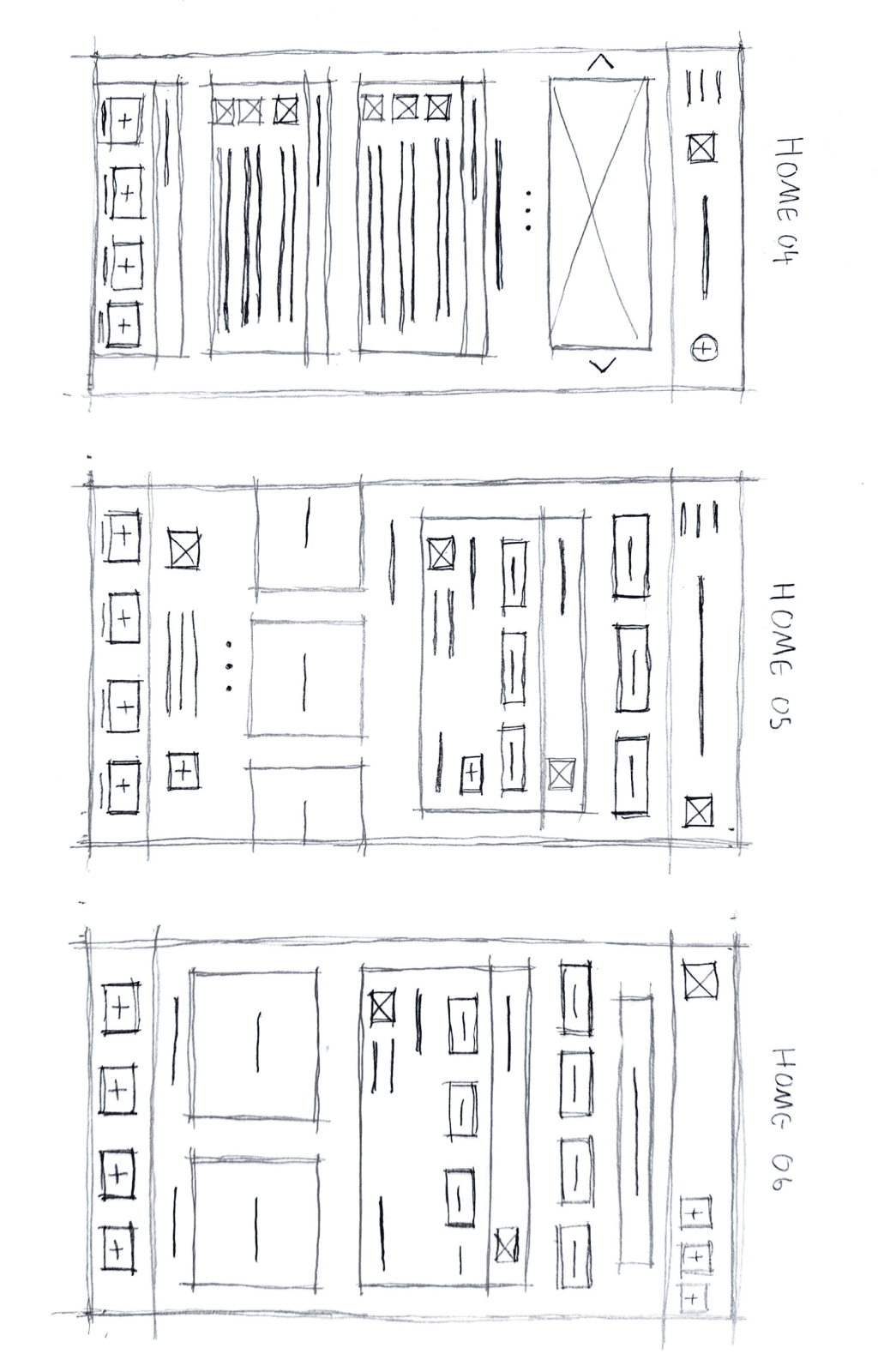
Early design sketches to set the scene.
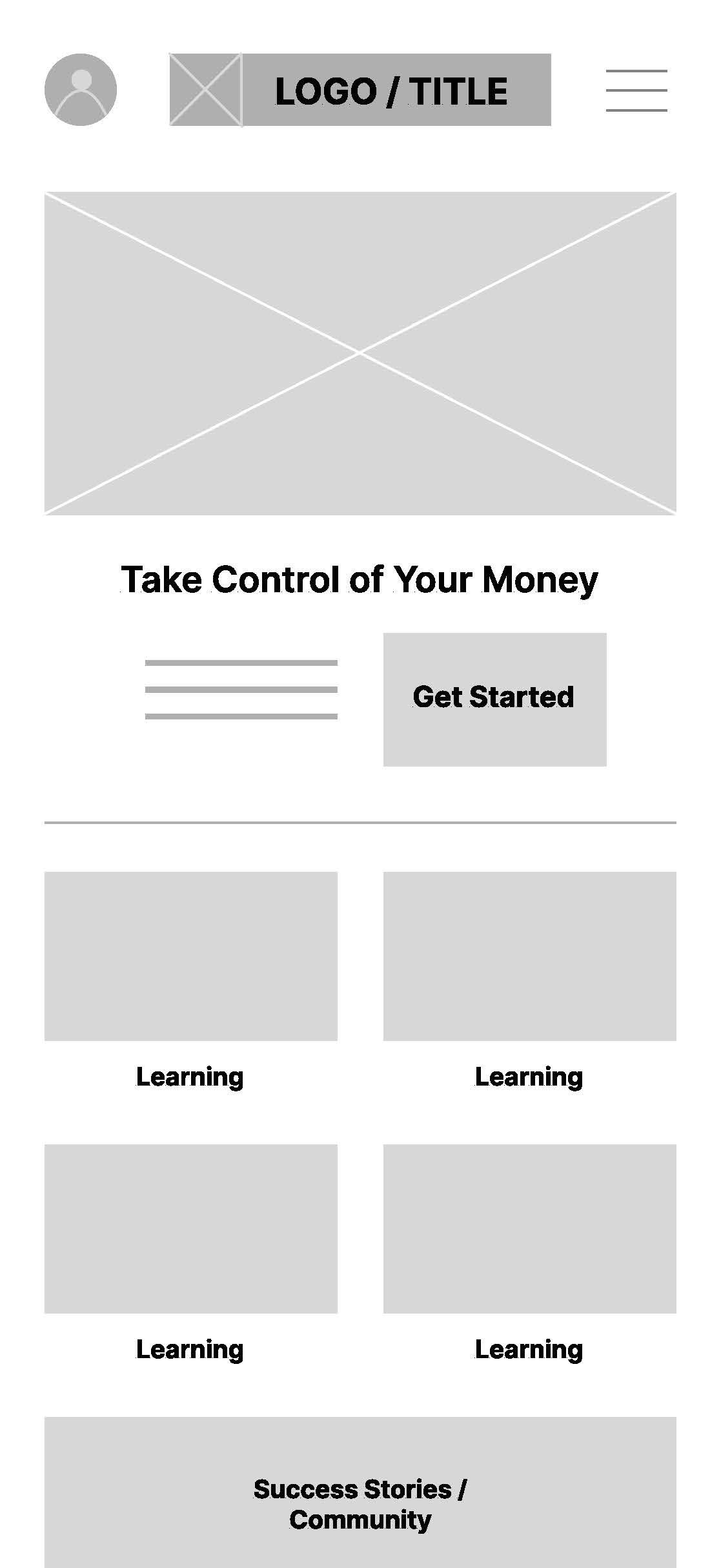
My initial low-fidelity wireframes focused on defining layout, hierarchy, and user flows without getting distracted by visual styling. At this stage, I aimed to validate the fundamental structure of the core experience.
Core Experience
+
What I Explored
+
What I Learned From Lo-Fi Testing
+
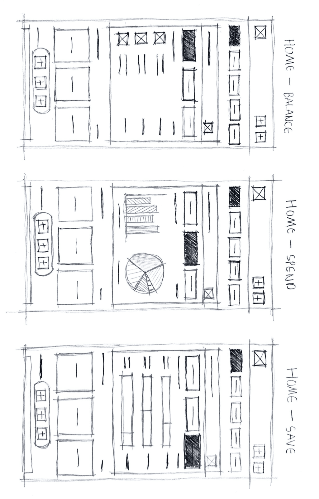
WIREFRAMING /
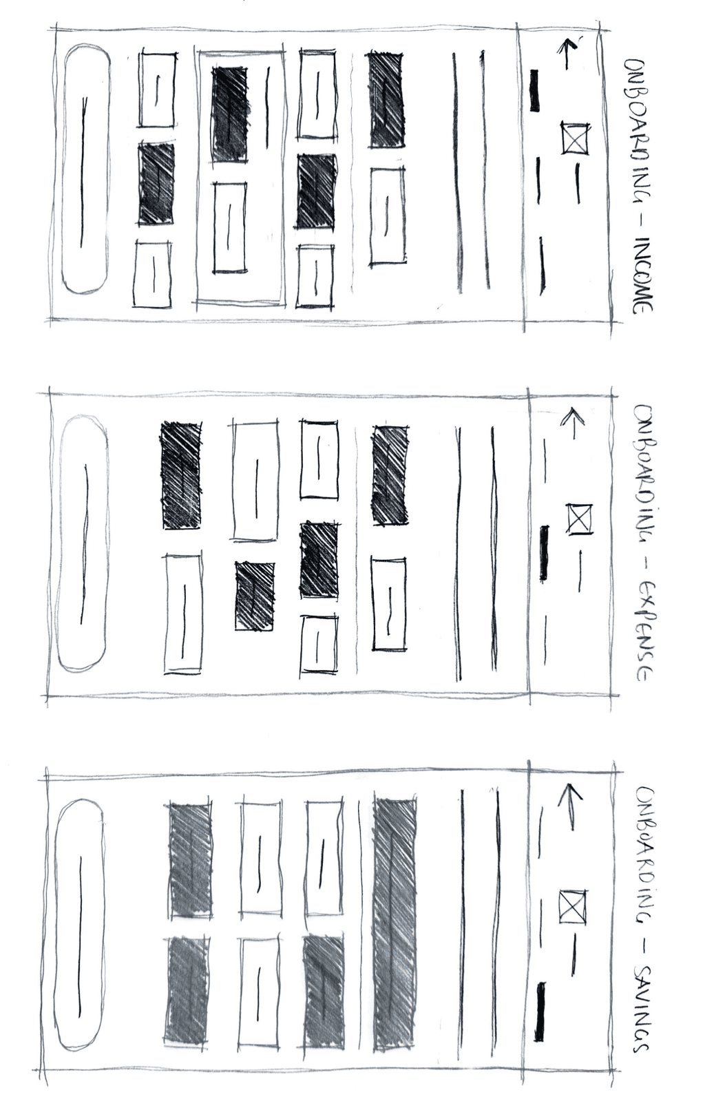
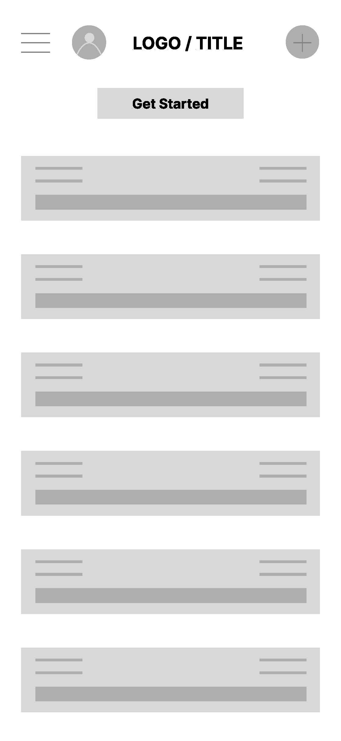
HOME SCREEN & DASHBOARD PAPER WIREFRAMES
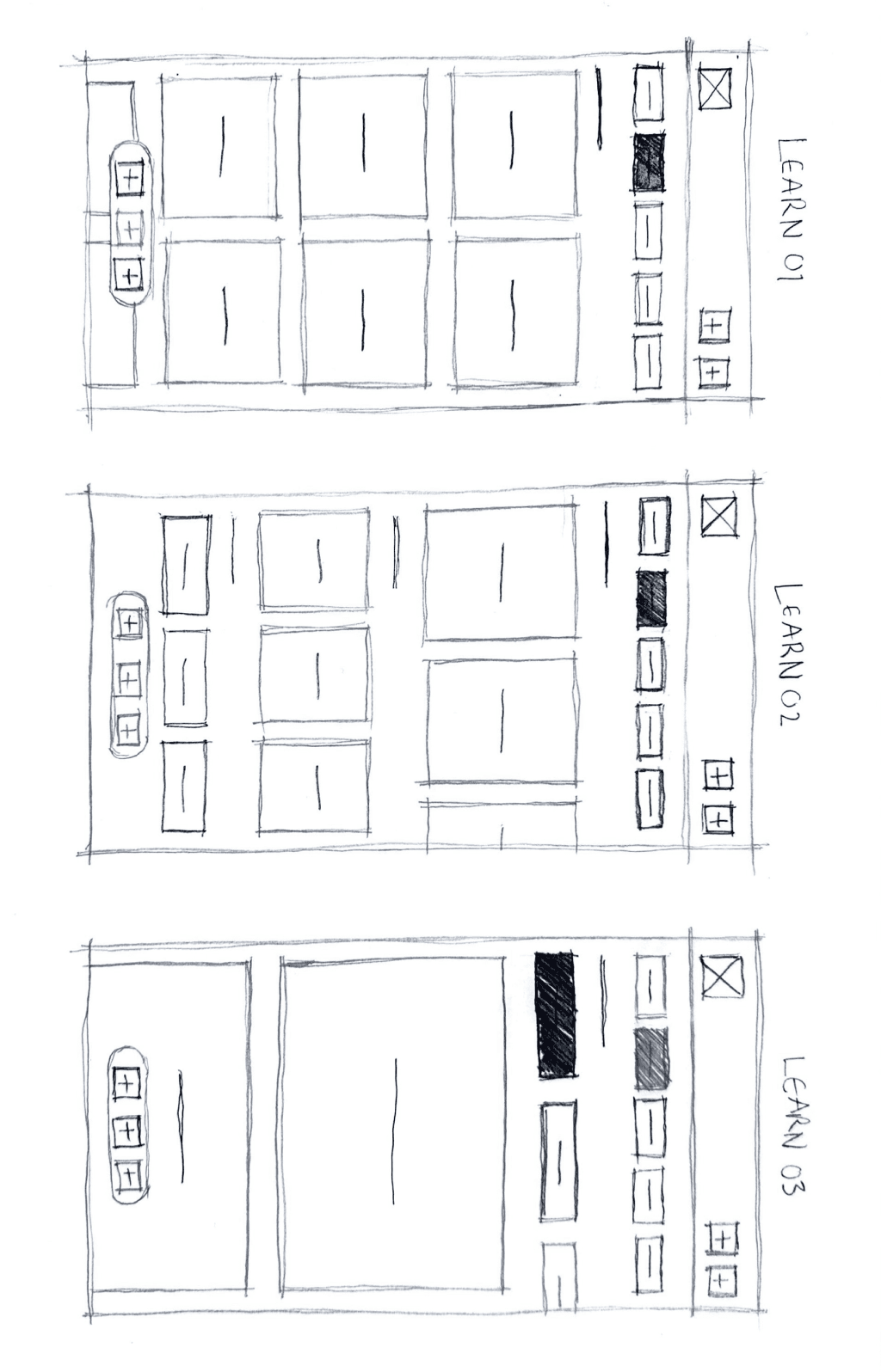
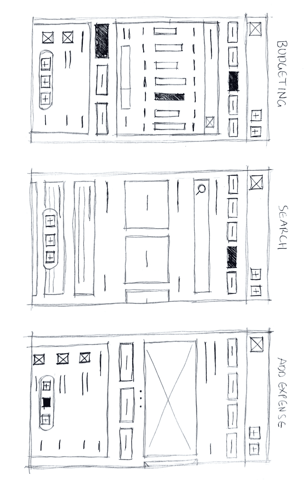
WIREFRAMING /
LEARN HUB & BUDGETING PAPER WIREFRAMES
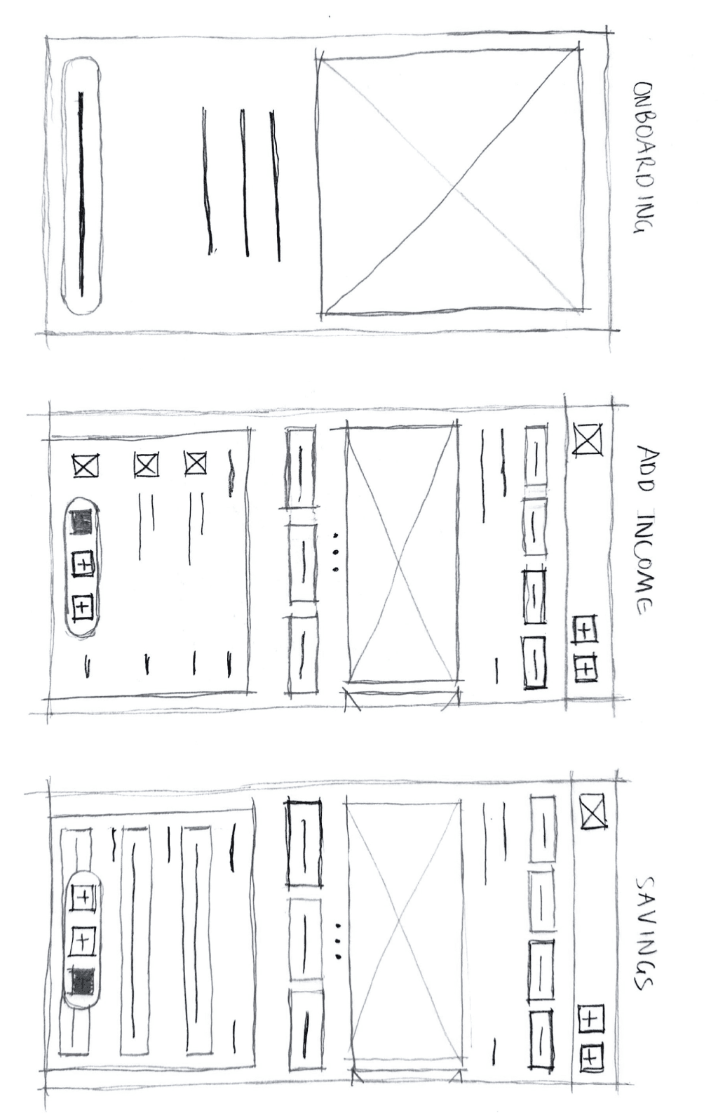
WIREFRAMING /
ONBOARDING & HOME SCREEN DEVELOPMENT
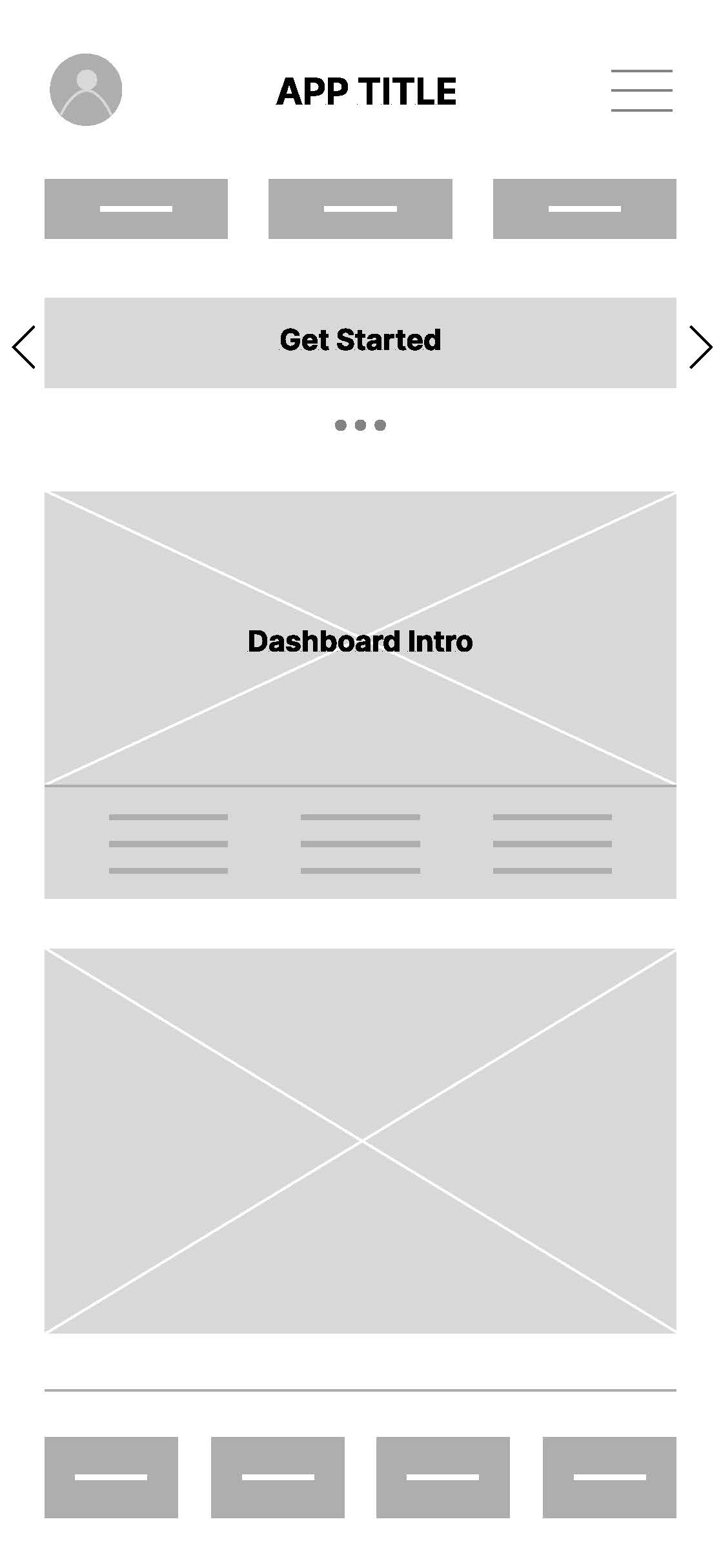
Refining paper wireframes into digital lo-fi wireframes.
After validating the structure through paper wireframes, I translated the early concepts into digital low-fidelity wireframes.
This step refined spacing, alignment, and flow while keeping the focus on layout and functionality. The digital wireframes bridged rough sketches and mid-fidelity screens.
What I Explored
+
What I Learned
+
Value Of This Step
+

07
PROTOTYPING
User flows to align product with real user behaviour.
To ensure the experience aligned with real user behaviour, I mapped all primary flows before prototyping. These flows were based on the persona Liam Thompson, a recent graduate managing irregular income.
Primary Persona User Flow
+
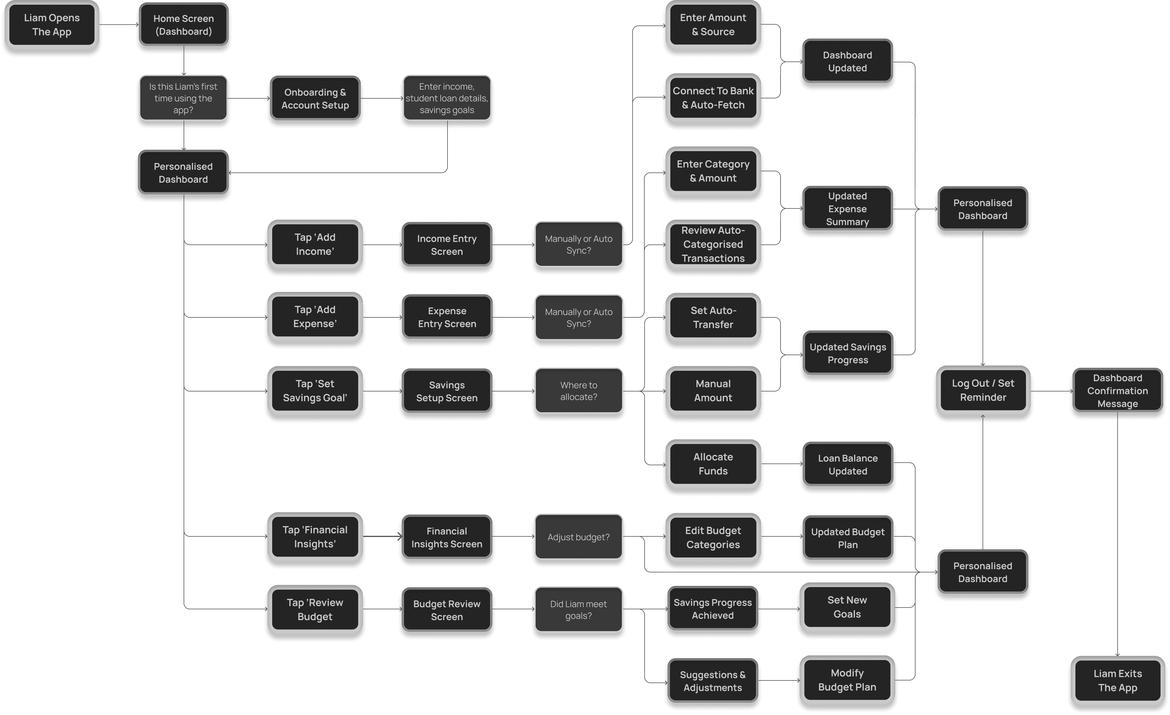
Y = YES
N = NO
M = MANUAL
A = AUTO SYNC
E = EMERGENCY FUND
S = SAVINGS
L = LOAN
PROTOTYPE /
PRIMARY PERSONA USER FLOW
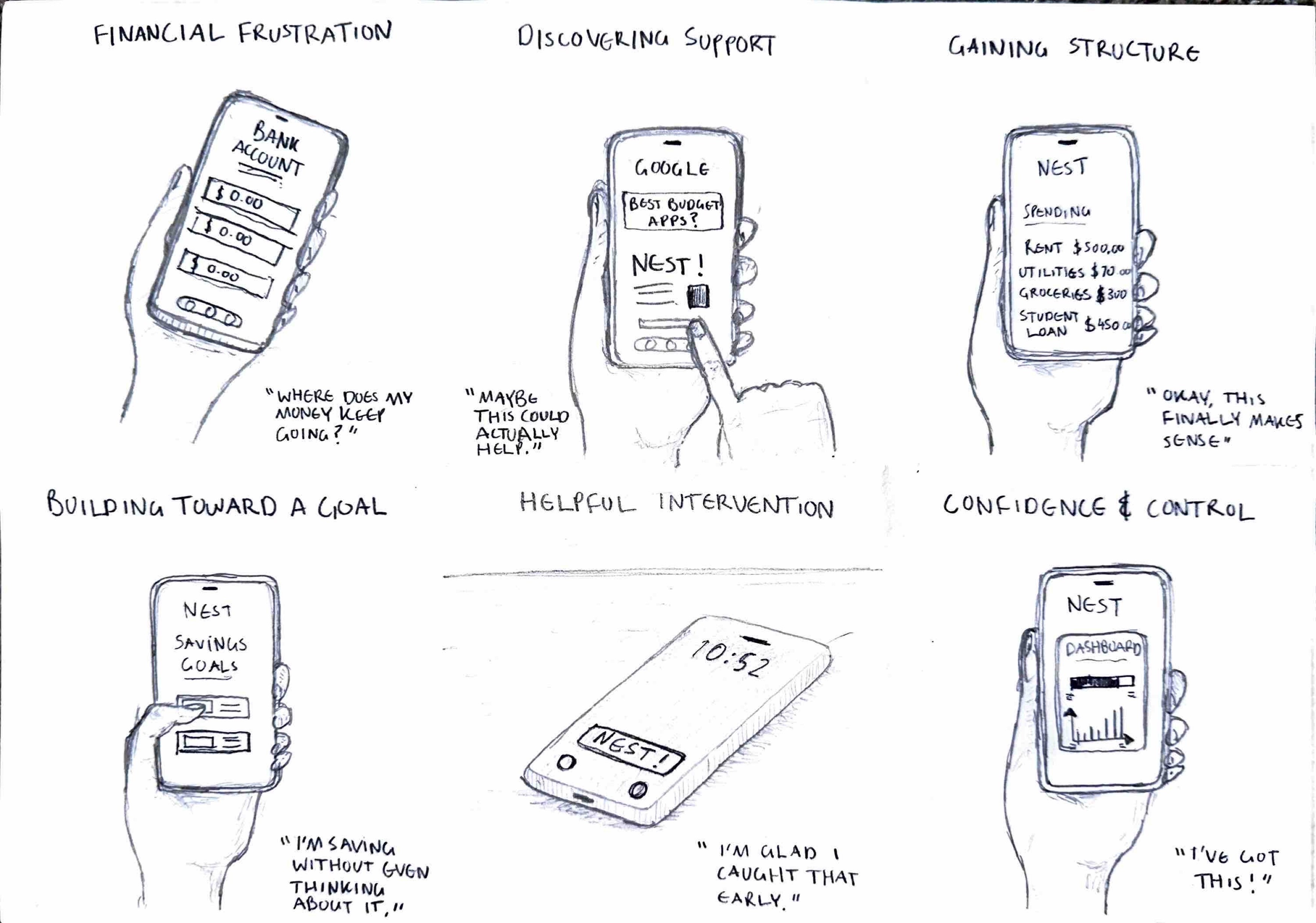
Big-picture storyboard to validate real life product interaction.
To visualise how Liam would interact with the product in real life I used a big-picture storyboard, which helped validate that each screen solves part of his real problem.
This storyboard highlights Liam’s emotional journey as he transitions from financial uncertainty to confidence through the product.
PROTOTYPE /
CLOSE-UP STORYBOARD
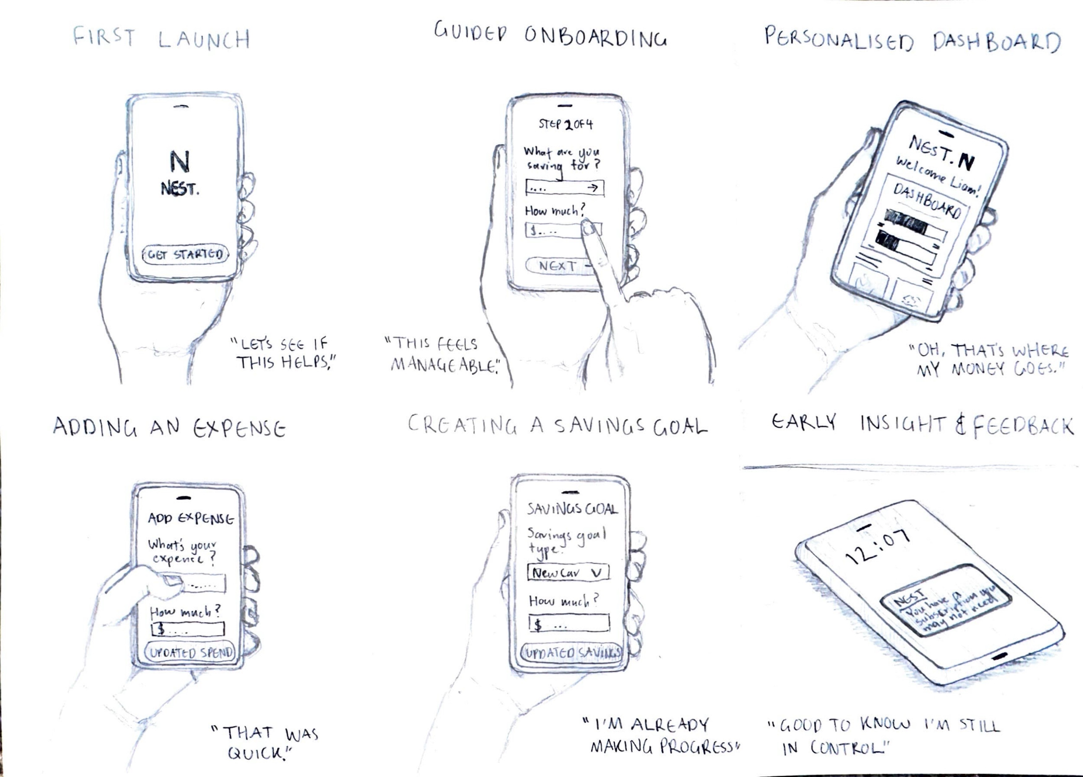
Close-up storyboard to deep dive into the user’s product interaction.
A deeper look into Liam’s interaction with the product during setup and early usage.
PROTOTYPE /
CLOSE-UP STORYBOARD
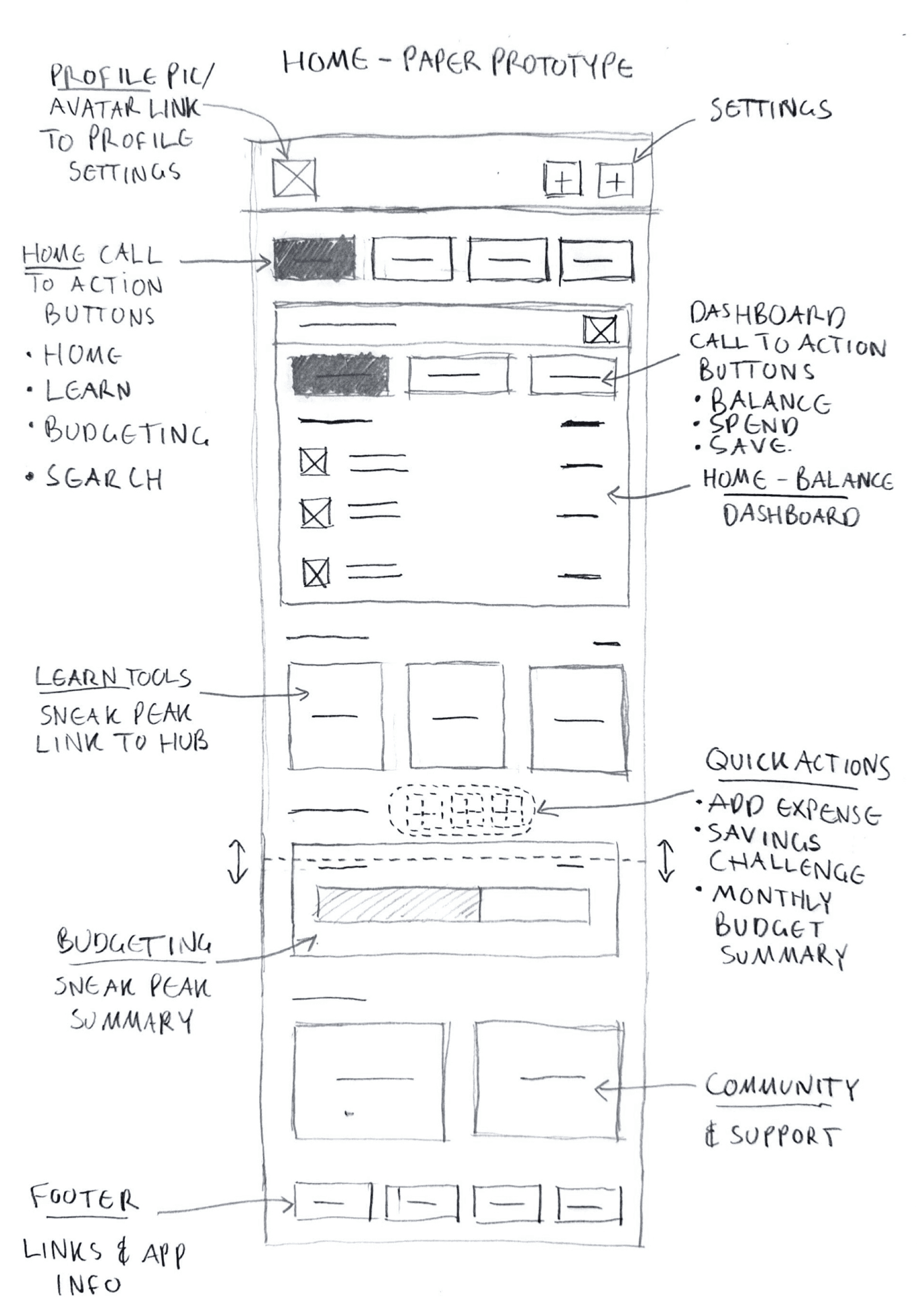
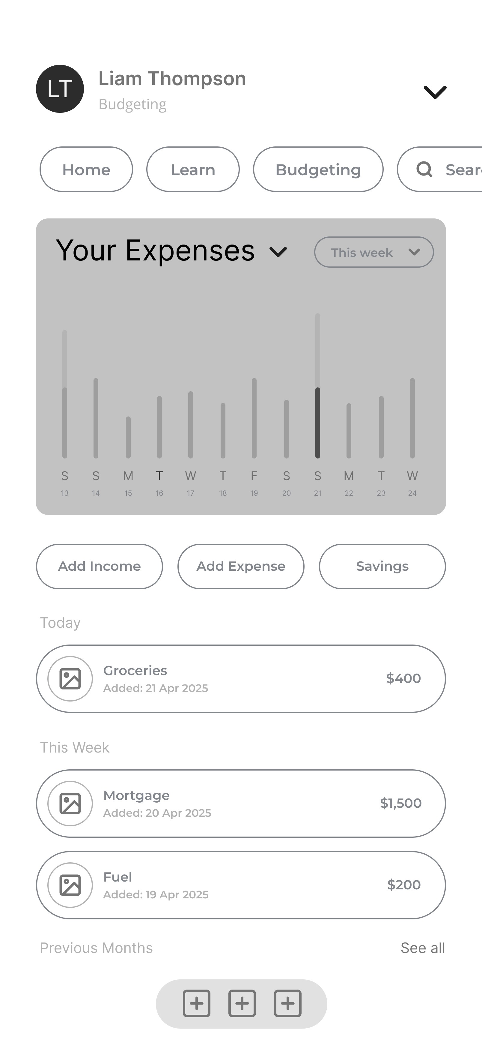
Refining the homepage and dashboard structure.
The dashboard was designed to act as the central anchor of the experience, giving users an immediate understanding of their financial position while surfacing the most important actions and insights.
This structure ensures clarity at a glance, reduces cognitive load, and supports quick decision-making.
What I Explored
+
Key Sections Highlighted
+
Value Of This Step
+
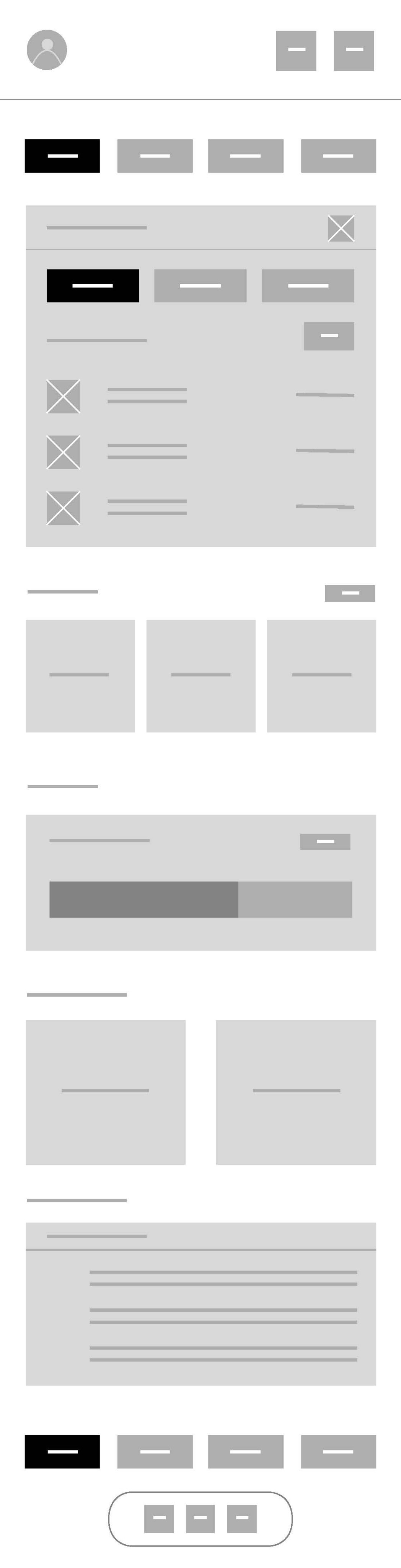
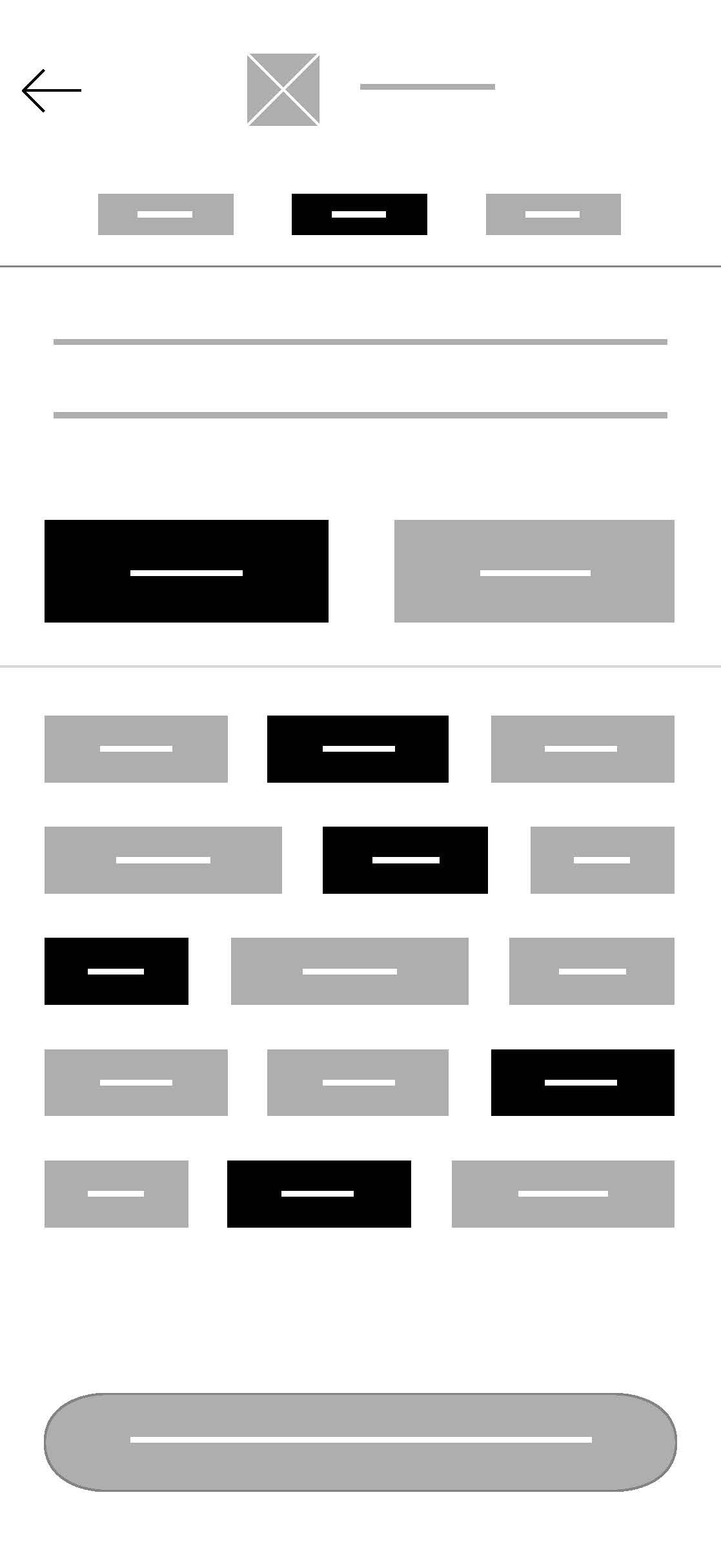
DIGITAL WIREFRAME - DASHBOARD
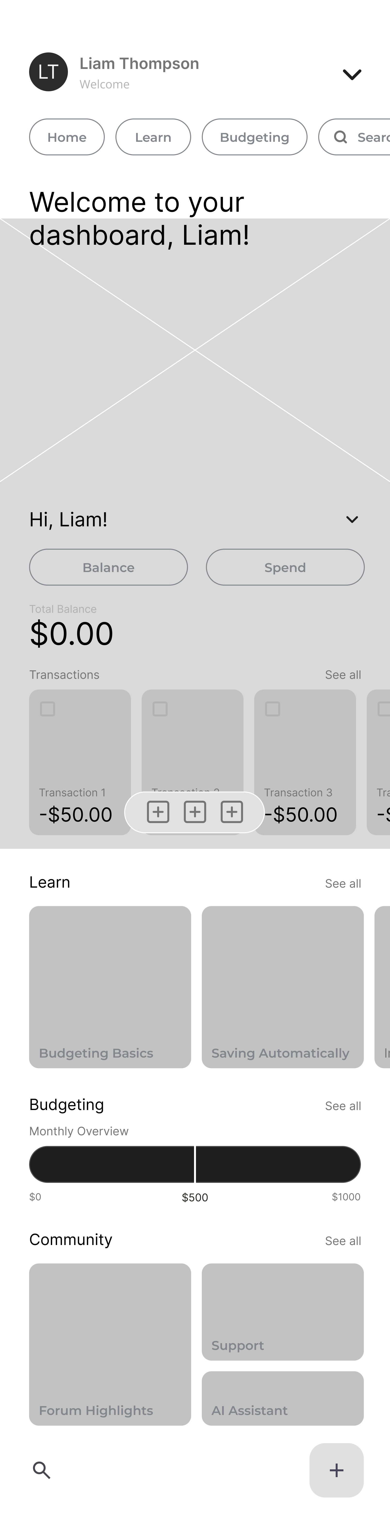
LO-FI PROTOTYPE - DASHBOARD
PROTOTYPING /
DIGITAL WIREFRAMING OF THE HOME DASHBOARD DEVELOPED INTO A LO-FI PROTOTYPE
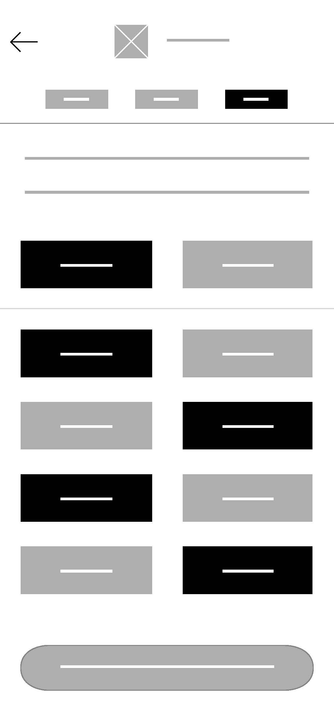
Additional screens developed.
To demonstrate the full scope of the product and how each feature works together, I designed a complete set of supporting screens beyond the dashboard.
These screens ensure users can move seamlessly from setup to ongoing financial management.
What I Explored
+
What I Learned
+
Lo-fidelity prototyping.
I created an early clickable prototype to validate core flows and screen transitions before moving into higher fidelity design.
This prototype focuses on structure and navigation rather than visual polish.
Lo-Fidelity Key Flows Demonstrated
+
DASHBOARD TO BUDGETING
DASHBOARD TO BUDGETING
PROTOTYPE /
LO-FI PROTOTYPING CORE FLOWS & SCREEN TRANSITIONS
08
USABILITY TESTING
Usability study to validate key user flows.
I conducted a moderated remote usability study to evaluate how effectively the budgeting and savings app supports users in completing core financial tasks.
The study focused on validating key flows, identifying usability issues, and ensuring the experience feels clear and efficient for first-time and returning users.
Study Overview
+
Usability study goals identified:
01
First-Time Use (Onboarding → Dashboard Setup)
02
Add Income (Manual)
03
Add Expense (Manual)
04
Create Savings Goal
First-Time Use (Onboarding → Dashboard)
+
Add Income (Manual)
+
Add Expense (Manual)
+
Create Savings Goal
+
USABILITY TESTING /
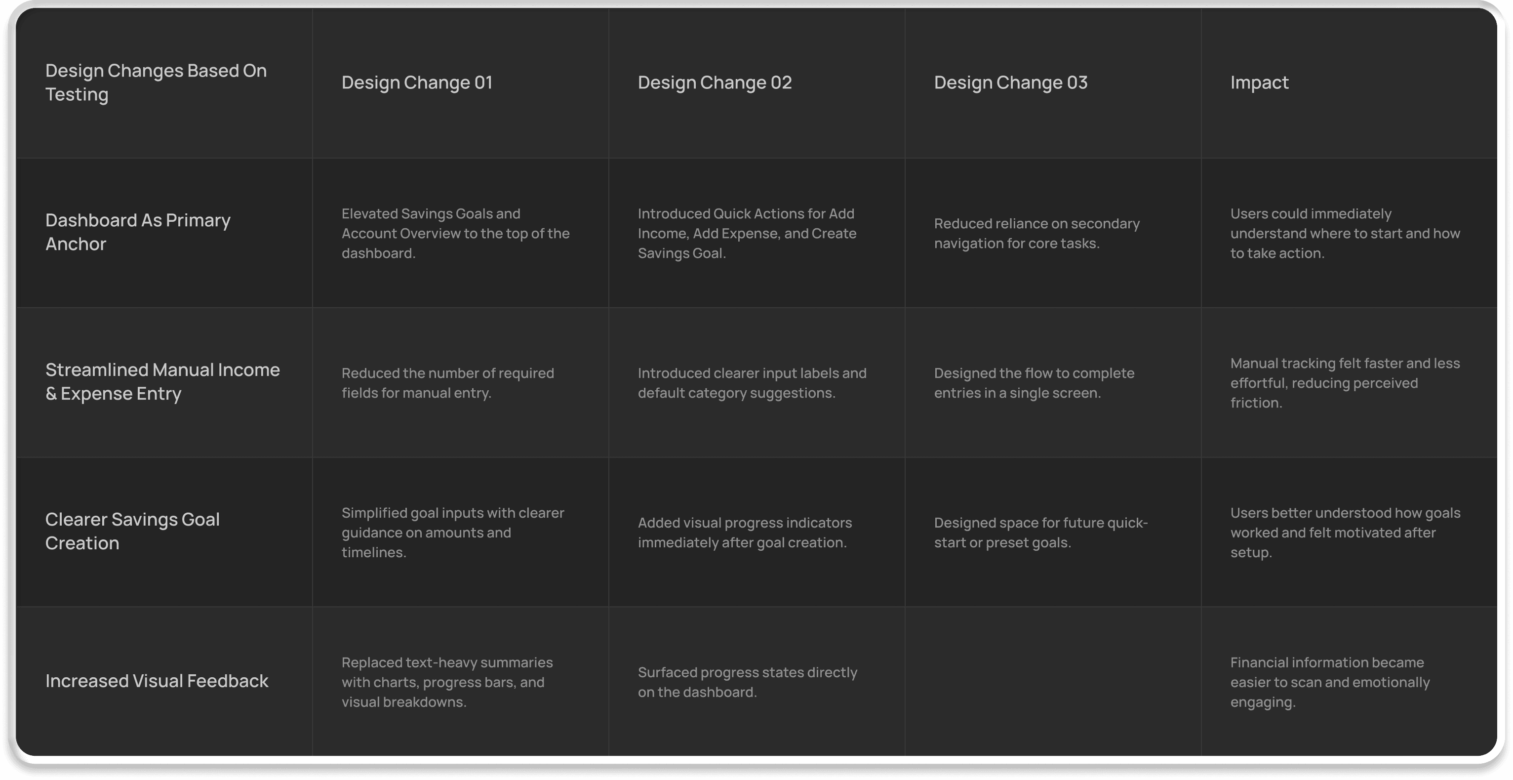
DESIGN CHANGES BASED ON TESTING
Participants were asked to complete the following tasks without assistance:
01
Complete onboarding and reach the dashboard
02
Add a source of income manually
03
Add a recent expense and assign a category
04
Create a savings goal with a target amount and timeframe
Success Criteria
+
Usability study outcomes.
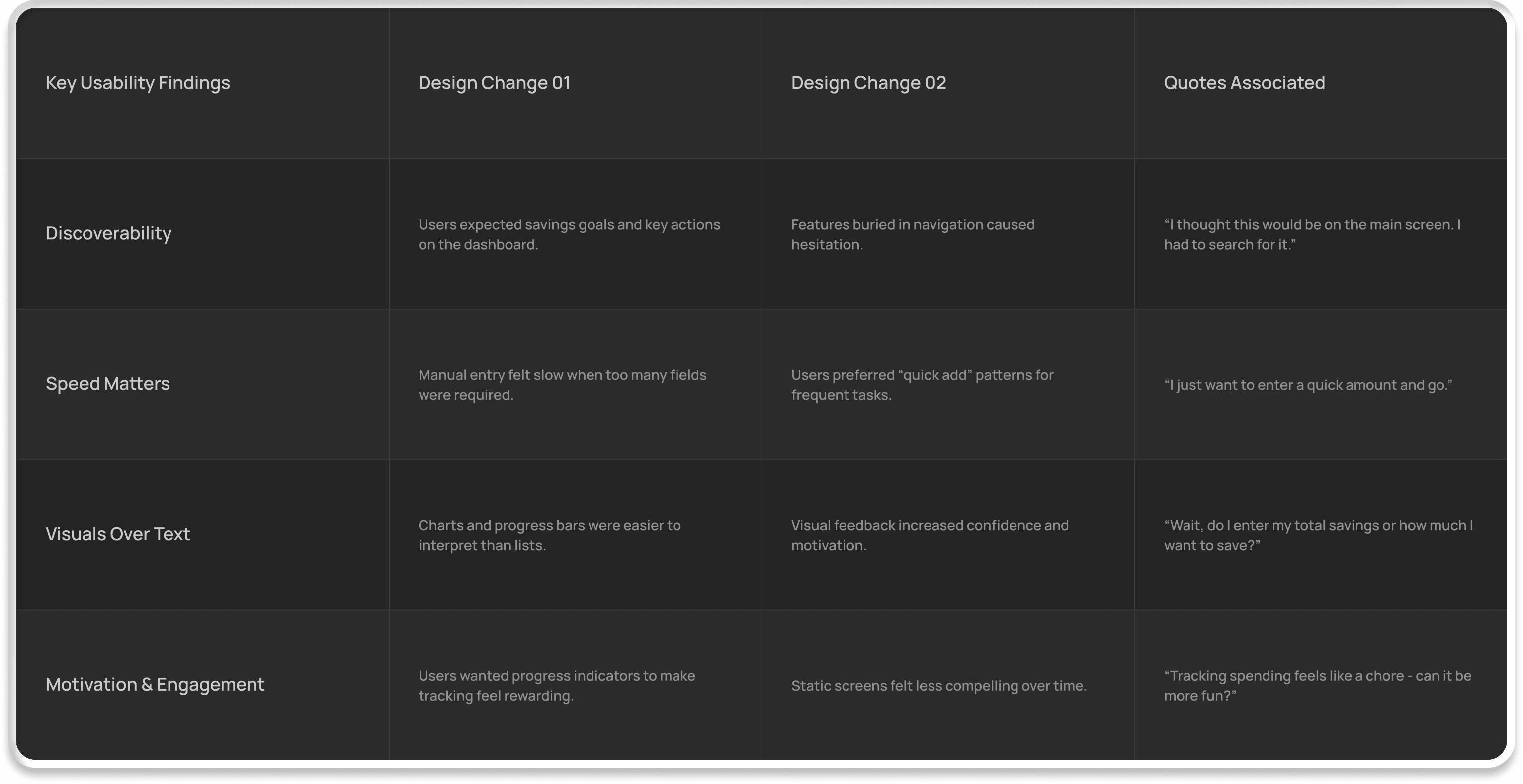
The study surfaced consistent insights around dashboard expectations, input efficiency, and feature discoverability.
These findings directly informed design refinements to navigation hierarchy, quick actions, and visual feedback across the dashboard experience.
USABILITY TESTING /
KEY USABILITY FINDINGS
01 / DASHBOARD NOT ACTING AS A CLEAR PRIMARY ANCHOR
02 / MANUAL ENTRY FLOW WAS TOO SLOW FOR FREQUENT USE
03 / SAVINGS GOAL ACTION WAS HARD TO FIND
USABILITY TESTING /
KEY USABILITY FINDINGS & DESIGN IMPLEMENTATIONS
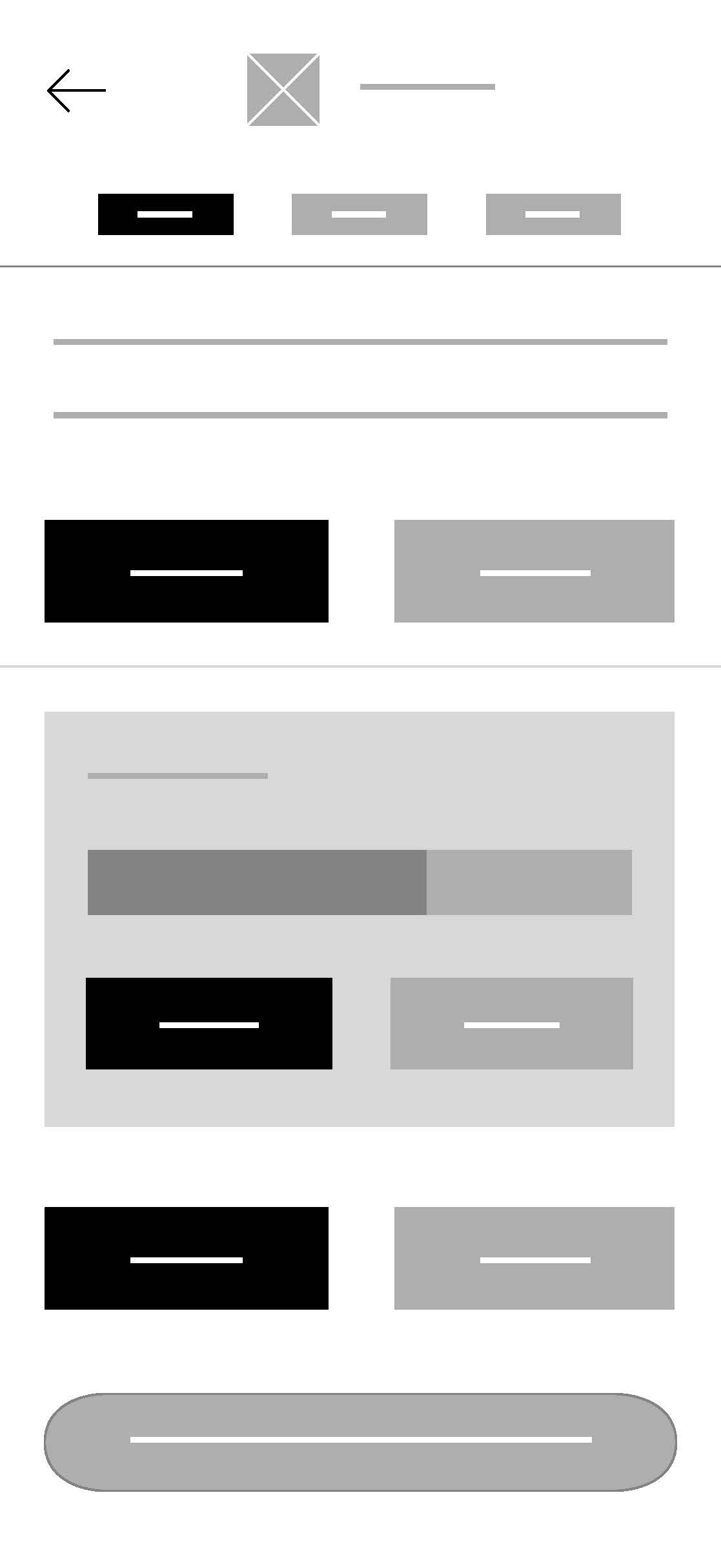
01 / DASHBOARD NOT ACTING AS A CLEAR PRIMARY ANCHOR - BEFORE
01 / DASHBOARD NOT ACTING AS A CLEAR PRIMARY ANCHOR - AFTER
02 / MANUAL ENTRY FLOW WAS TOO SLOW FOR FREQUENT USE - BEFORE
02 / MANUAL ENTRY FLOW WAS TOO SLOW FOR FREQUENT USE - AFTER
03 / SAVINGS GOAL ACTION WAS HARD TO FIND- BEFORE
03 / SAVINGS GOAL ACTION WAS HARD TO FIND - AFTER
USABILITY TESTING /
MID-FI PROTOTYPE DESIGN IMPLEMENTATIONS BEFORE & AFTER
ONBOARDING
DASHBOARD TO BUDGETING
USABILITY TESTING /
UPDATED MID-FI PROTOTYPES BASED ON USABILITY TESTING FEEDBACK
09
HIGH FIDELITY DESIGN
Wireframes and usability insights into hi-fi interfaces.
This phase focused on translating validated wireframes and usability insights into a polished, production-ready interface.
The goal was to create a calm, trustworthy experience that makes budgeting feel approachable, clear, and motivating - without overwhelming users.
Visual design goals identified:
01
Calm & Trustworthy
02
Friendly Tone Of Voice
03
Accessible Typography
04
Consistent Layout System
Visual Design Goals
+
Design System
+
Final Screens
+
Value Of This Step
+
INITIAL STYLE TESTING
FINAL STYLE DEVELOPED
HI-FI DESIGN /
STYLE TESTING AND DEVELOPMENT - OPENING THE APP FOR THE FIRST TIME
HI-FI DESIGN /
DESIGN SYSTEM STYLE GUIDE
HI-FI DESIGN /
DESIGN SYSTEM NAVIGATION & CONTENT
10
FINAL PRODUCT
A complete end-to-end budgeting experience.
The final product brings together research, testing, and iterative design into a cohesive budgeting experience focused on clarity, confidence, and habit-building.
Nest is designed to support users at every stage of their financial journey - helping them understand their spending, set achievable goals, and feel more in control of their money.
Product Overview
+
What Nest Delivers
+
Value Of This Step
+
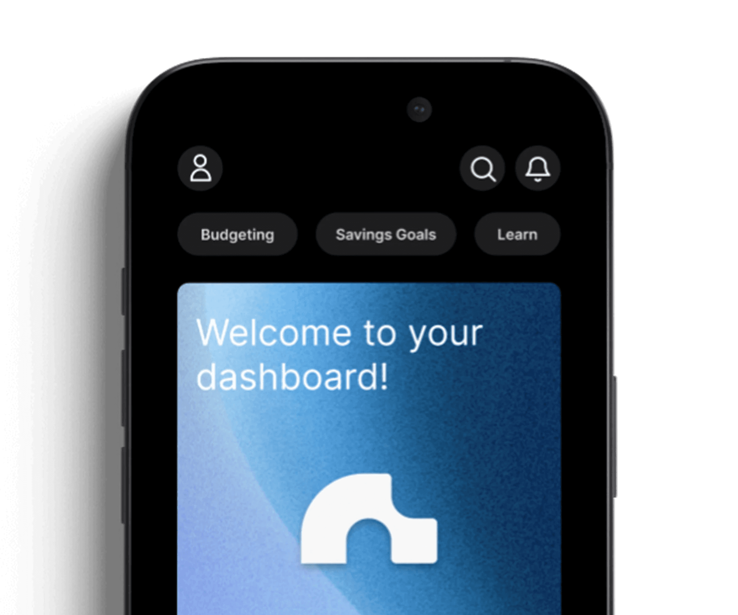
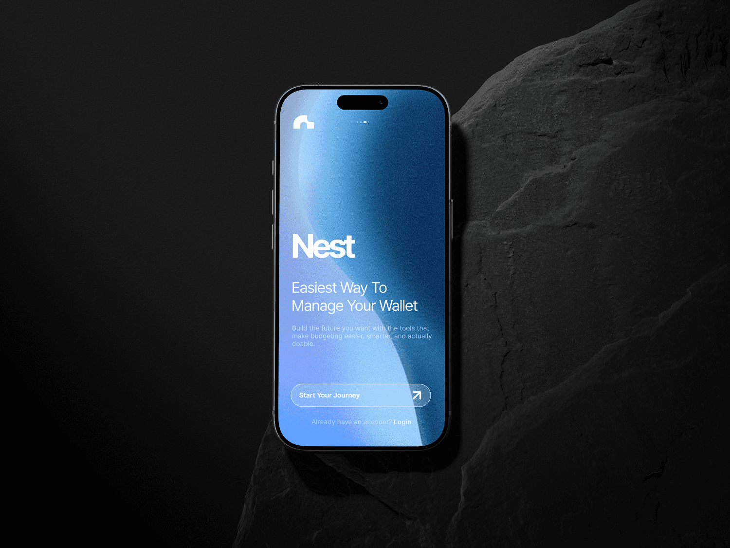
The splash screens.
The splash screens set a calm tone before any financial data appears. Testing showed users often open budgeting apps with hesitation, so the entry avoids immediate information and instead creates a brief moment of focus and trust.
A minimal loading state transitions into a soft branded environment, signalling the app is supportive rather than demanding and helping users enter with clarity and confidence.
INITIAL LOADING
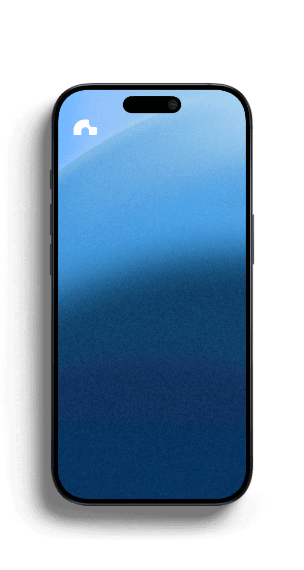
INITIAL SPLASH SCREEN
FINAL DESIGN /
SPLASH SCREEN
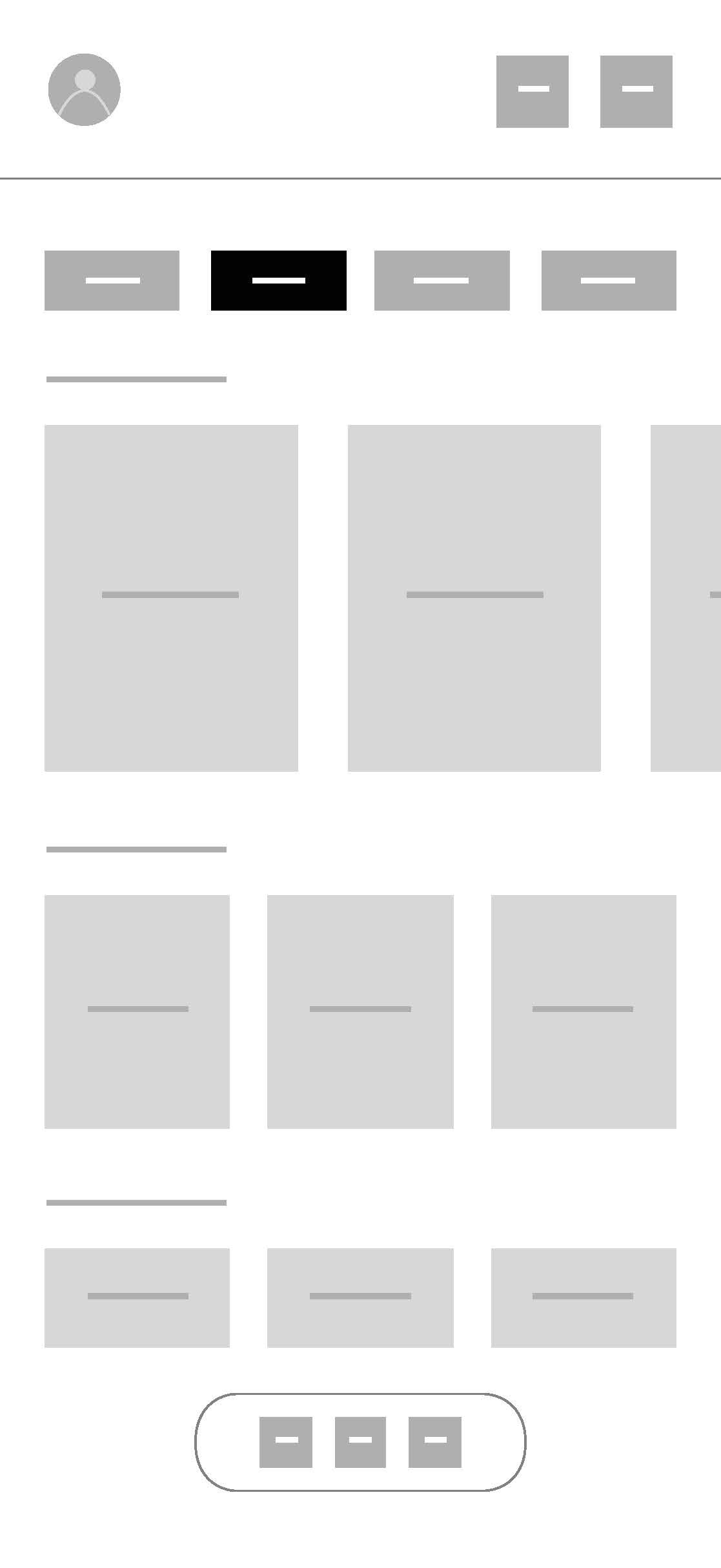
The landing screens.
The landing screens introduce the app’s purpose in a simple, reassuring way. Research showed users were unsure where to start, so messaging avoids feature-heavy explanations and frames budgeting as manageable and everyday.
Clear language, spacing, and visual consistency reduce cognitive load and build confidence before setup.
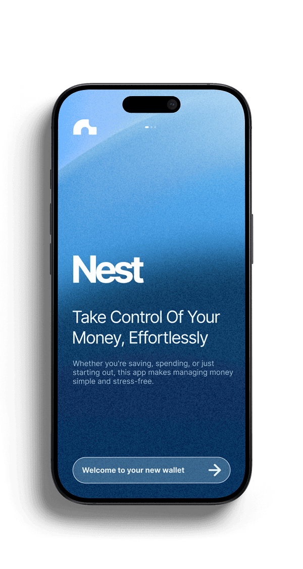
LANDING SCREEN 01
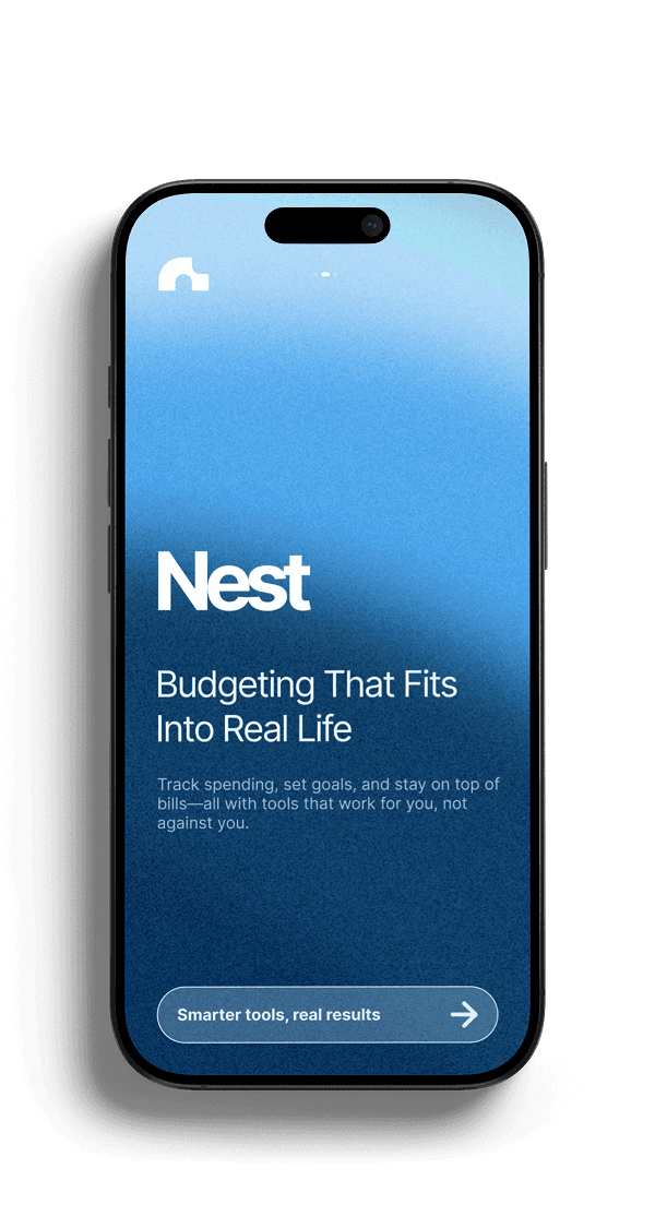
LANDING SCREEN 02
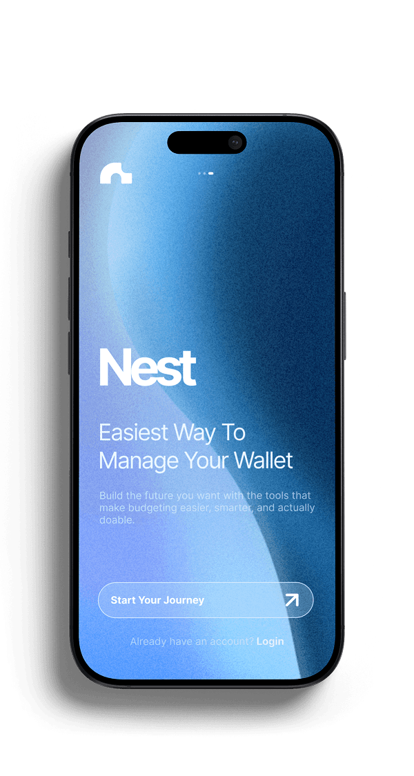
LANDING SCREEN 03
FINAL DESIGN /
LANDING SCREENS
Log in and sign up.
The authentication screens keep entry low pressure. Only essential fields are shown, with clear hierarchy guiding attention to the primary action while secondary options remain unobtrusive.
This allows users to complete setup quickly and move into the app without hesitation.
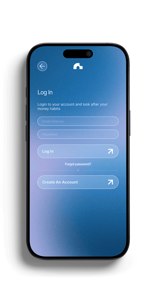
LOG IN SCREEN
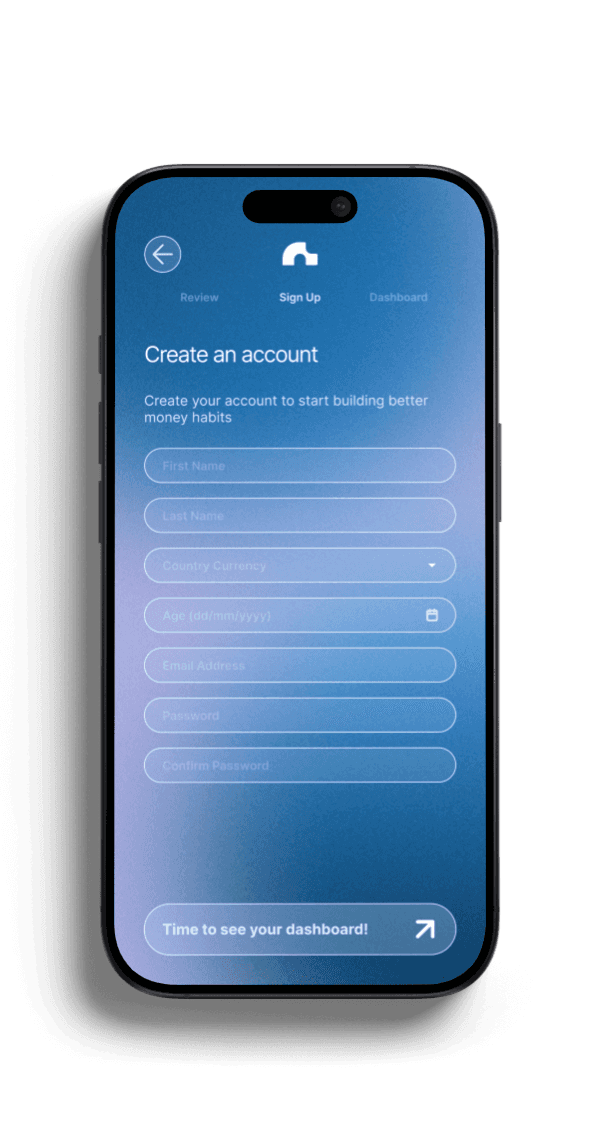
SIGN UP SCREEN (AFTER ONBOARDING SEQUENCE)
FINAL DESIGN /
LOG IN & SIGN UP
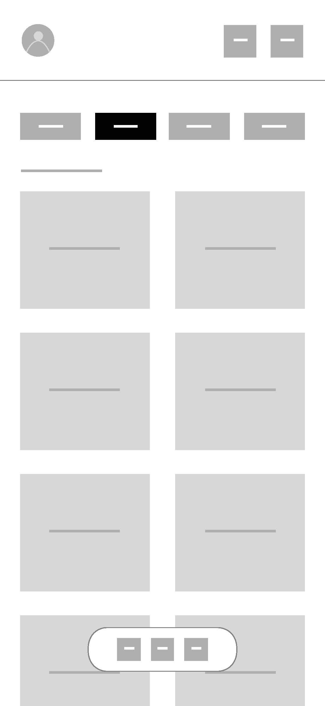
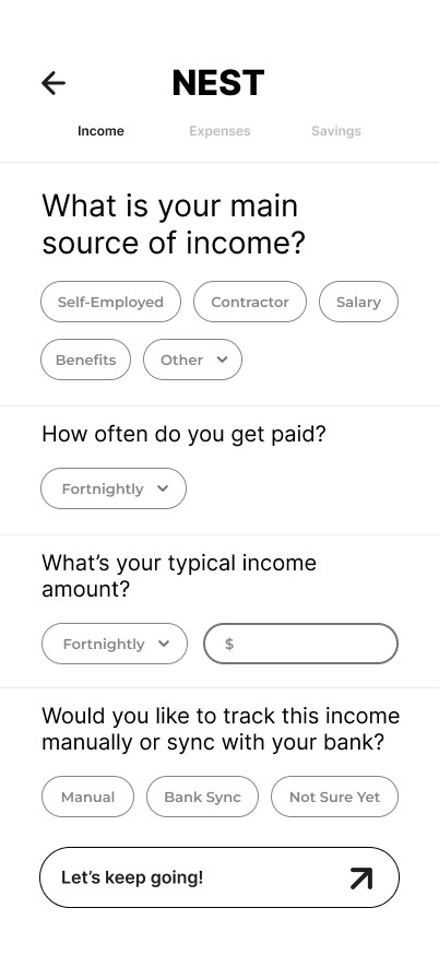
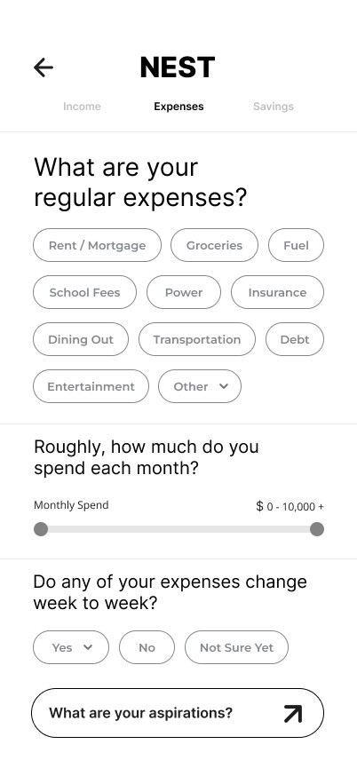
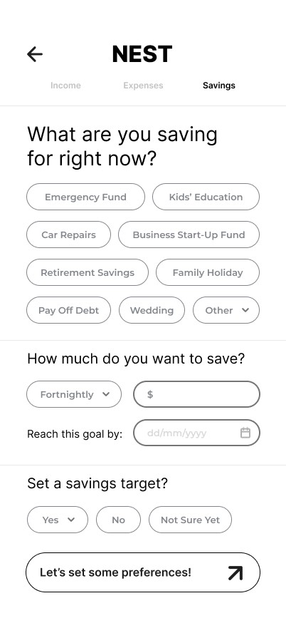
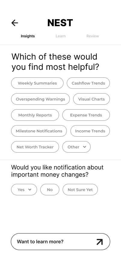
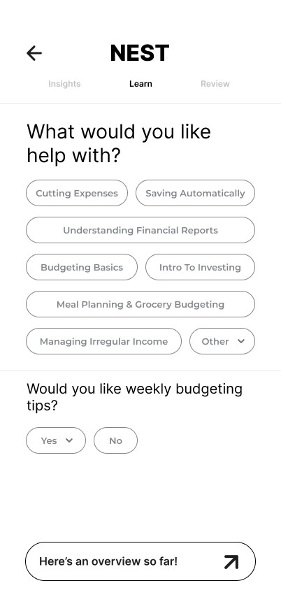
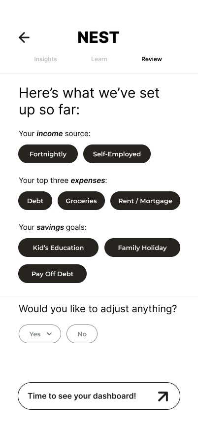
Onboarding.
Users felt overwhelmed by traditional setup flows, so onboarding breaks financial input into small, familiar steps using presets and progress cues.
This builds understanding progressively and increases confidence before reaching the dashboard.
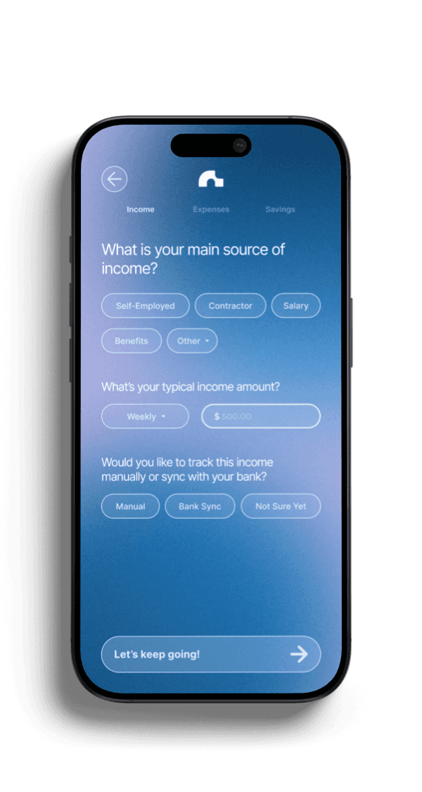
ONBOARDING INCOME
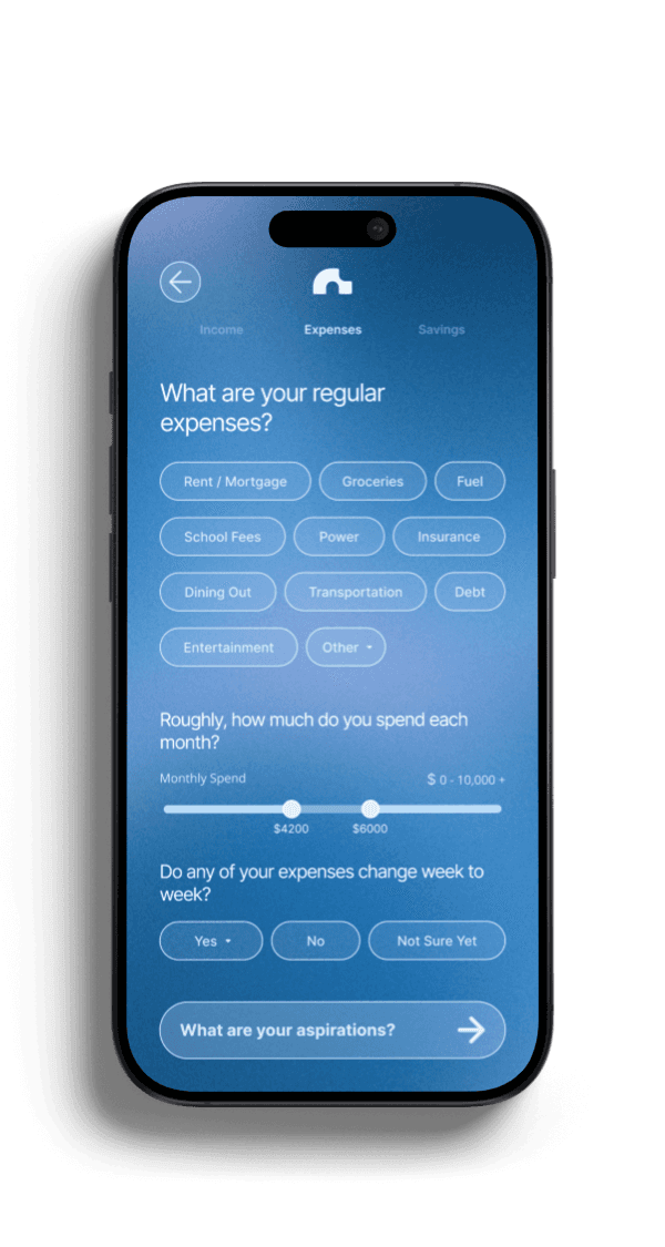
ONBOARDING EXPENSES
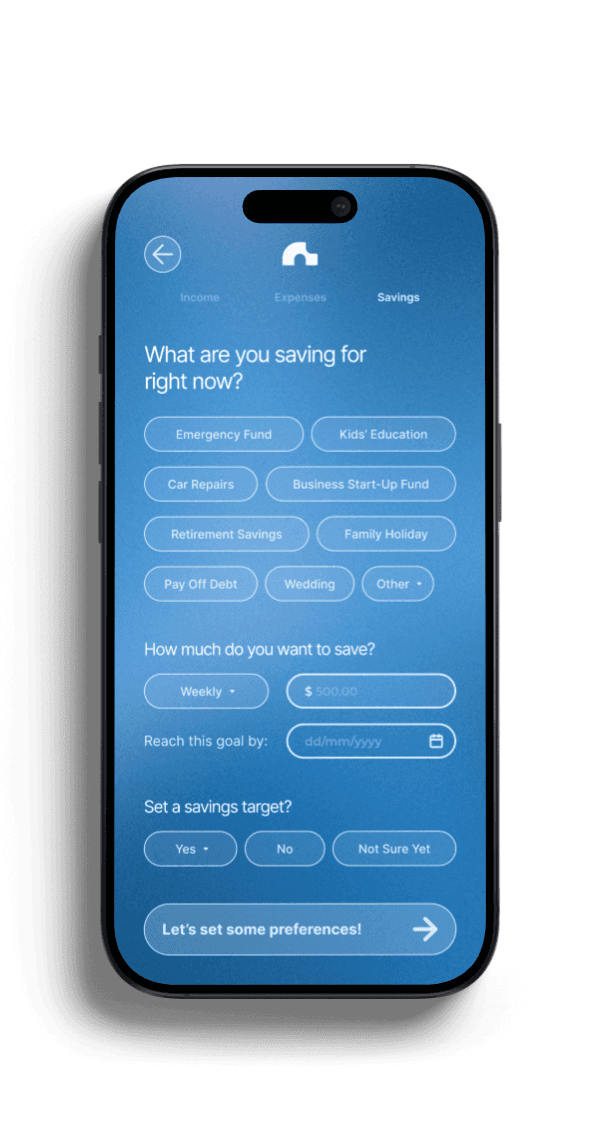
ONBOARDING SAVINGS
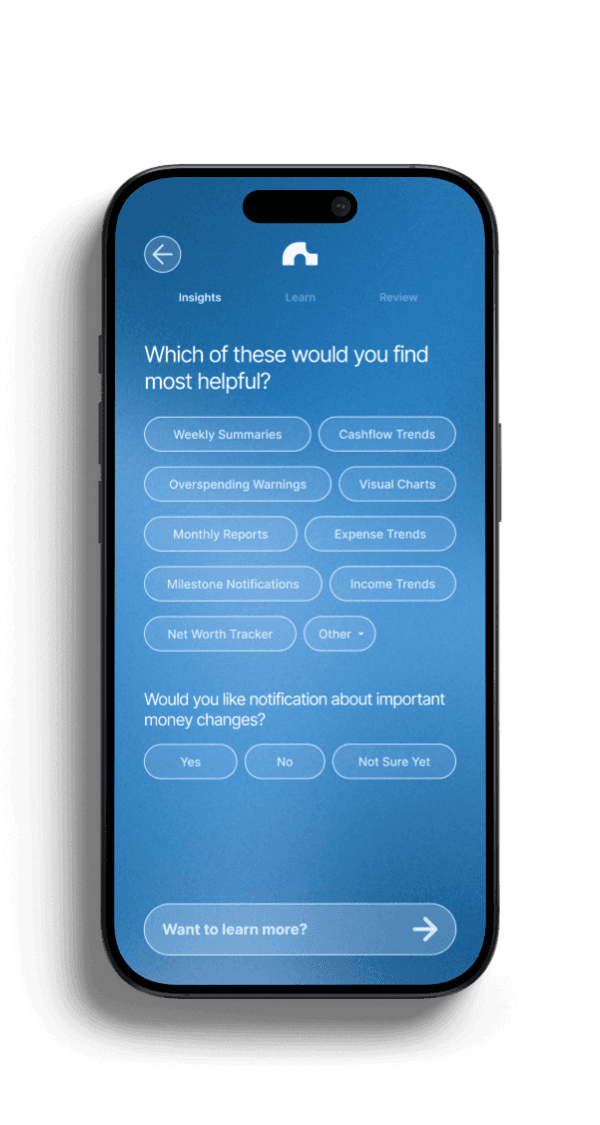
ONBOARDING INSIGHTS
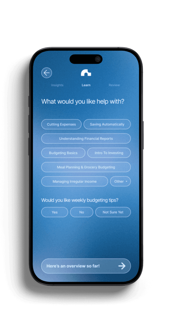
ONBOARDING LEARN
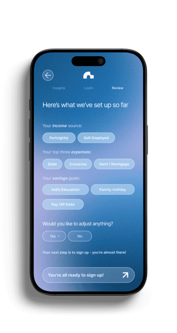
ONBOARDING REVIEW
FINAL DESIGN /
ONBOARDING
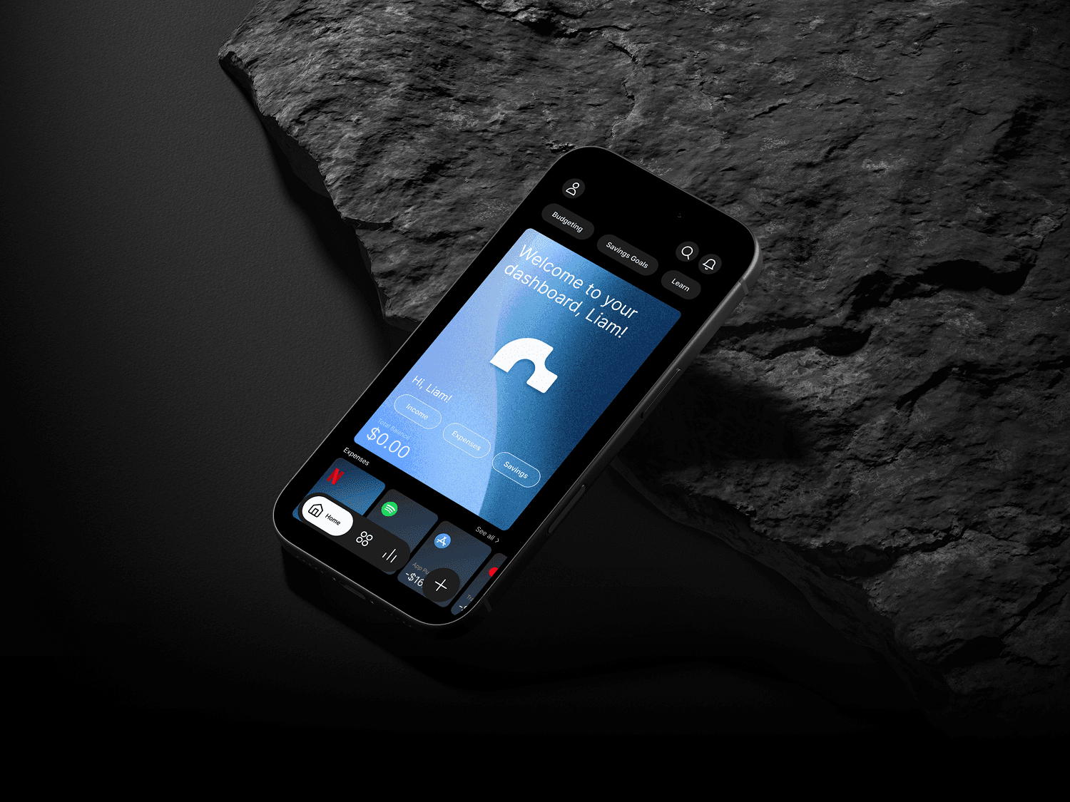
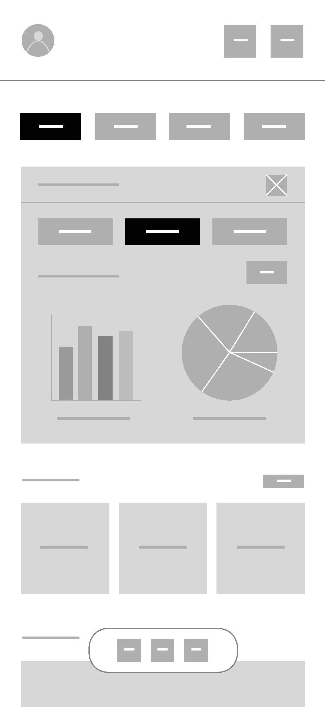
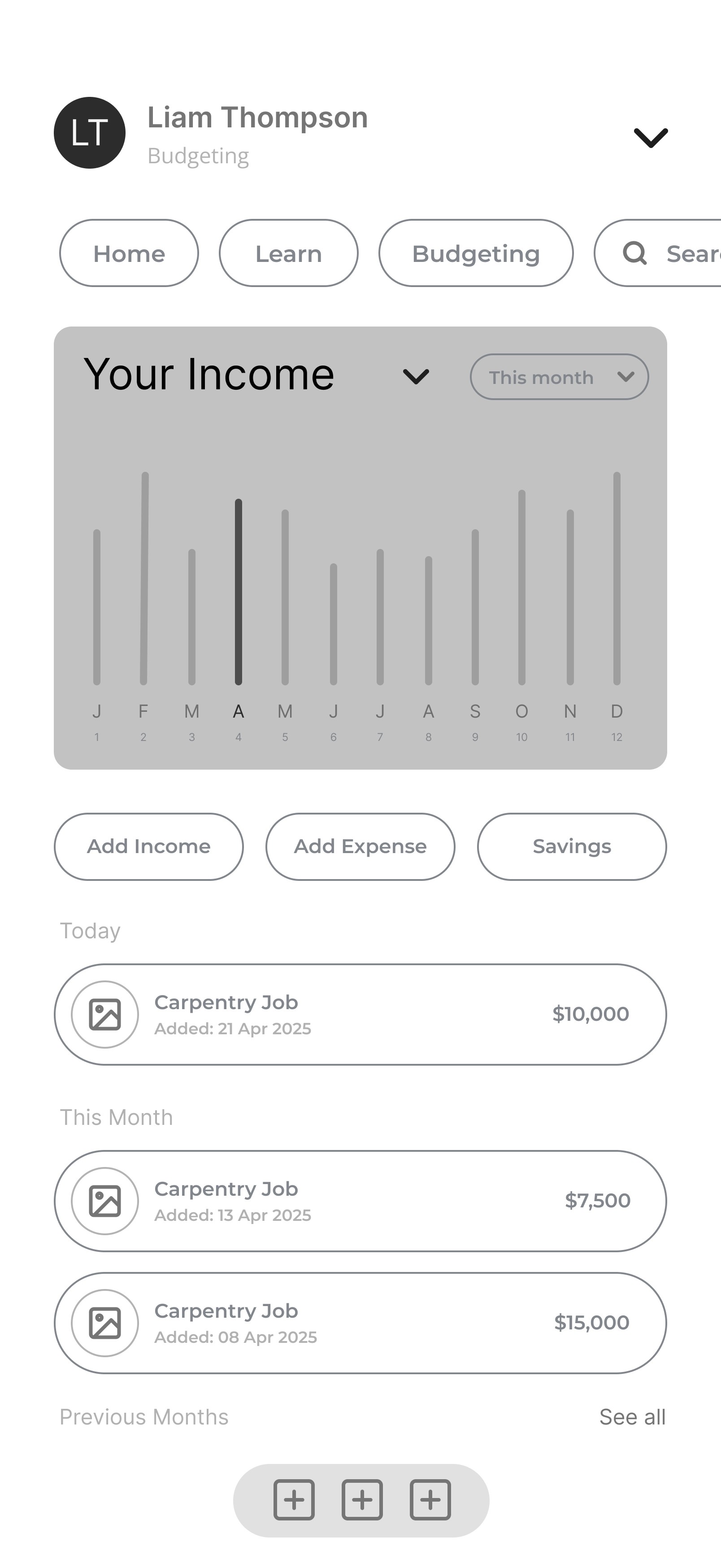
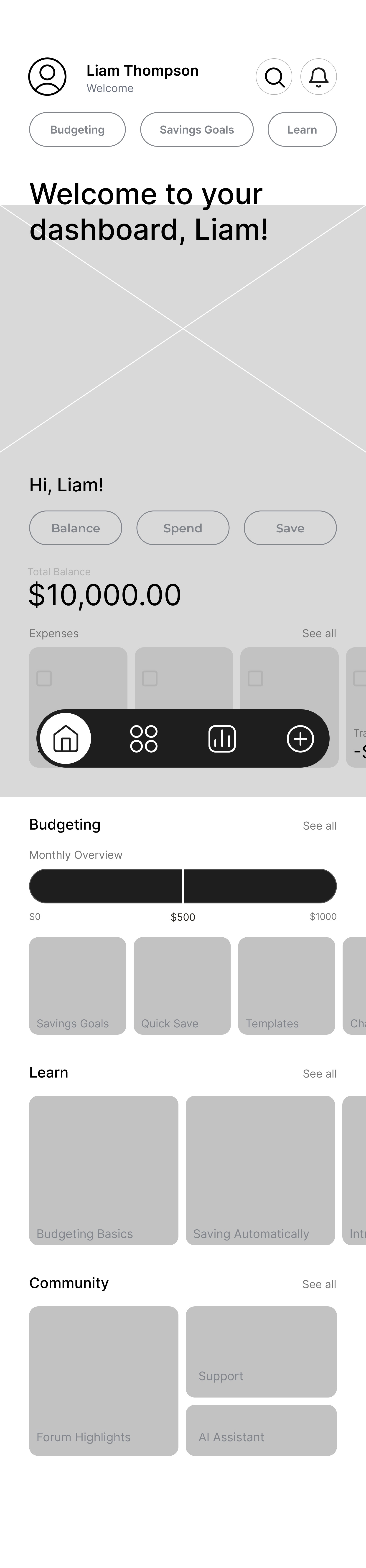
The homescreen dasboard.
Early testing showed users were unsure where to start after setup, so the dashboard was designed as the primary anchor.
A clear hierarchy and persistent navigation provide orientation and support quick check-ins.
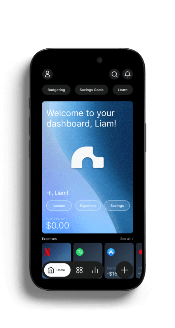
DASHBOARD IMAGE
DASHBOARD PROTOTYPE
FINAL DESIGN /
HOMESCREEN DASHBOARD
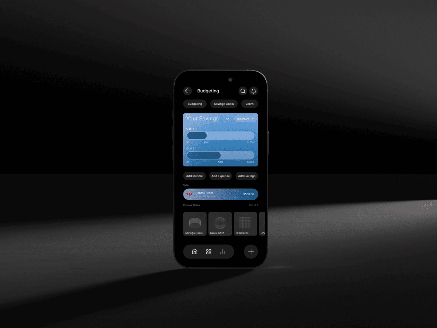
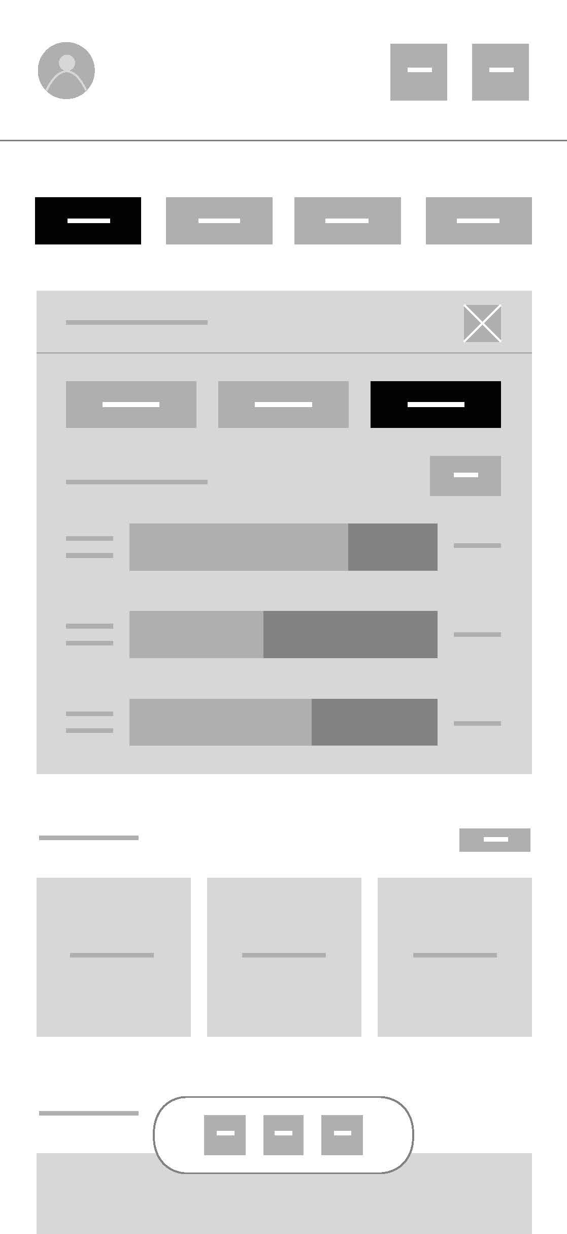
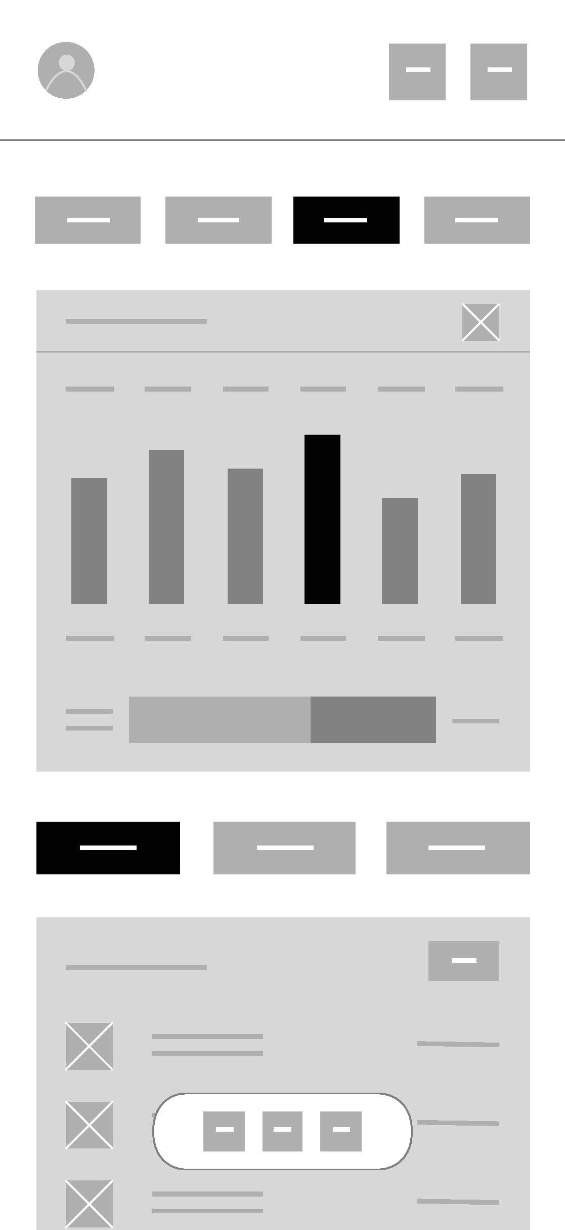
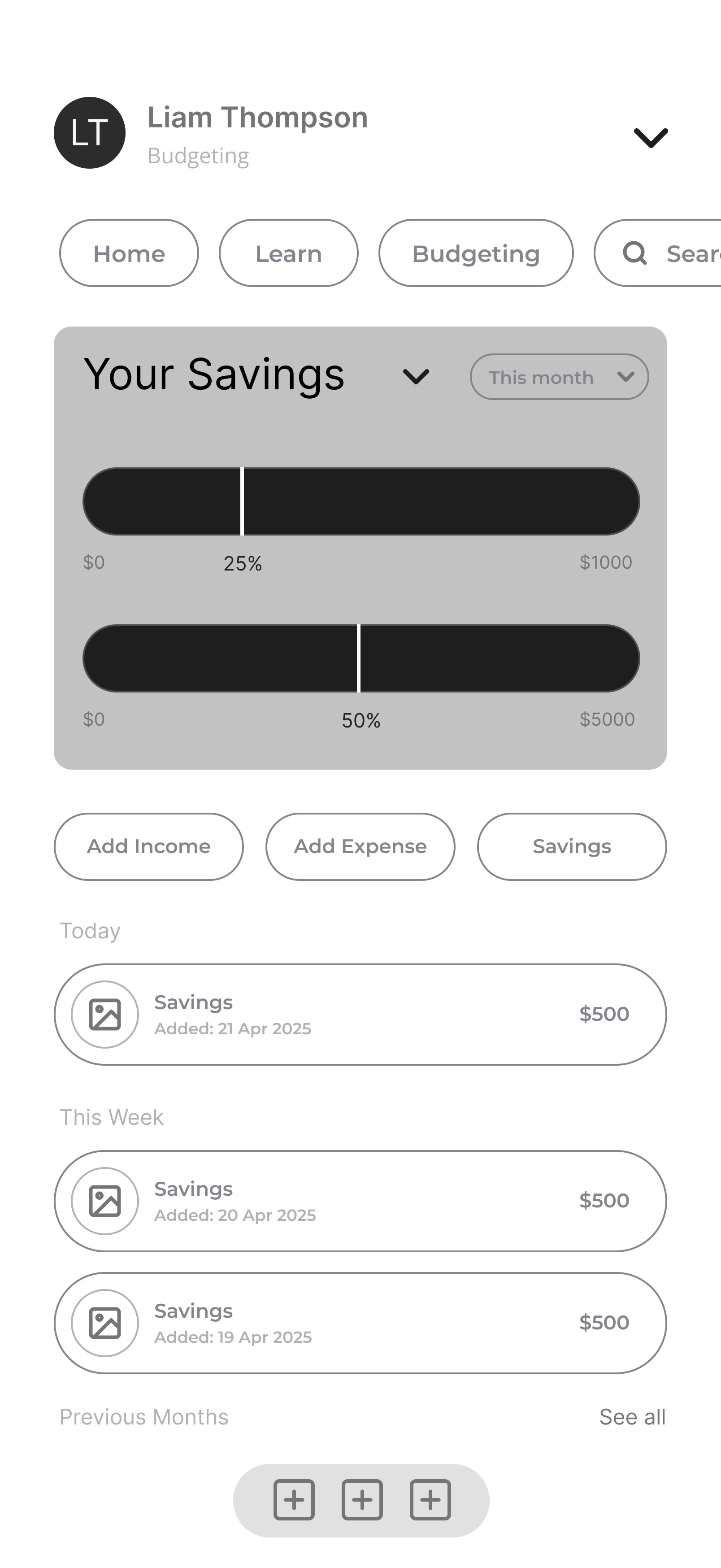
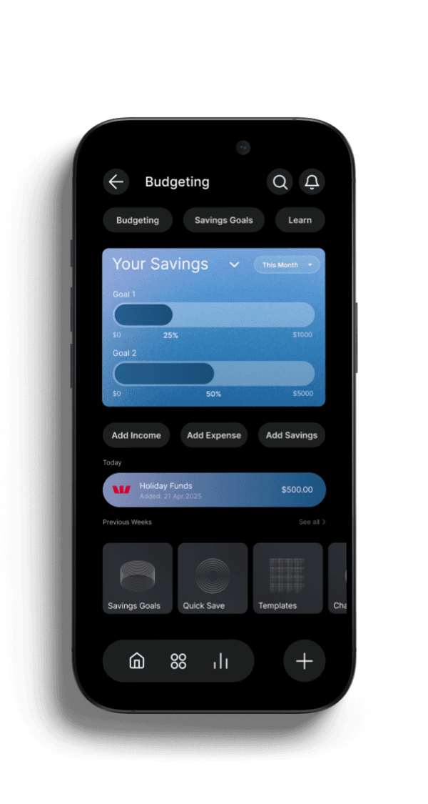
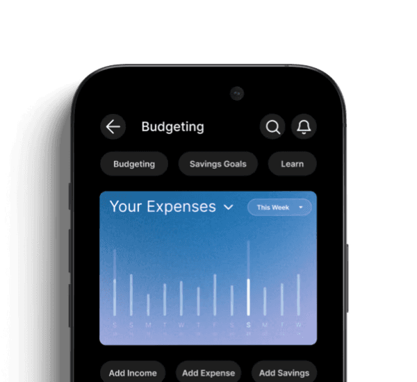
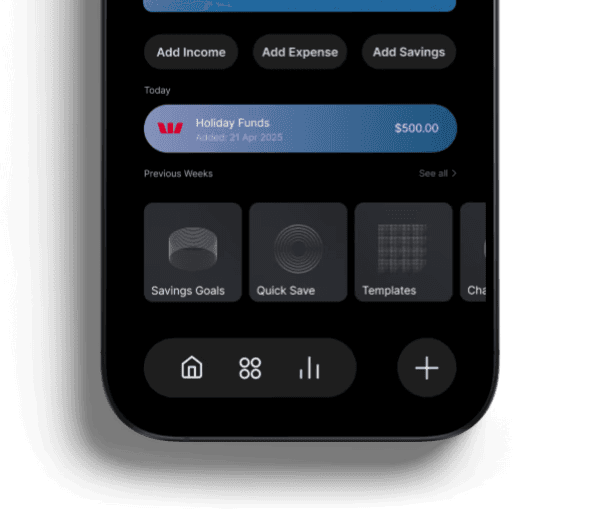
Budgeting.
Users preferred quick check-ins over deep analysis, so budgeting emphasises charts, recent activity, and immediate actions rather than dense tables.
This supports consistent tracking and reduces effort.
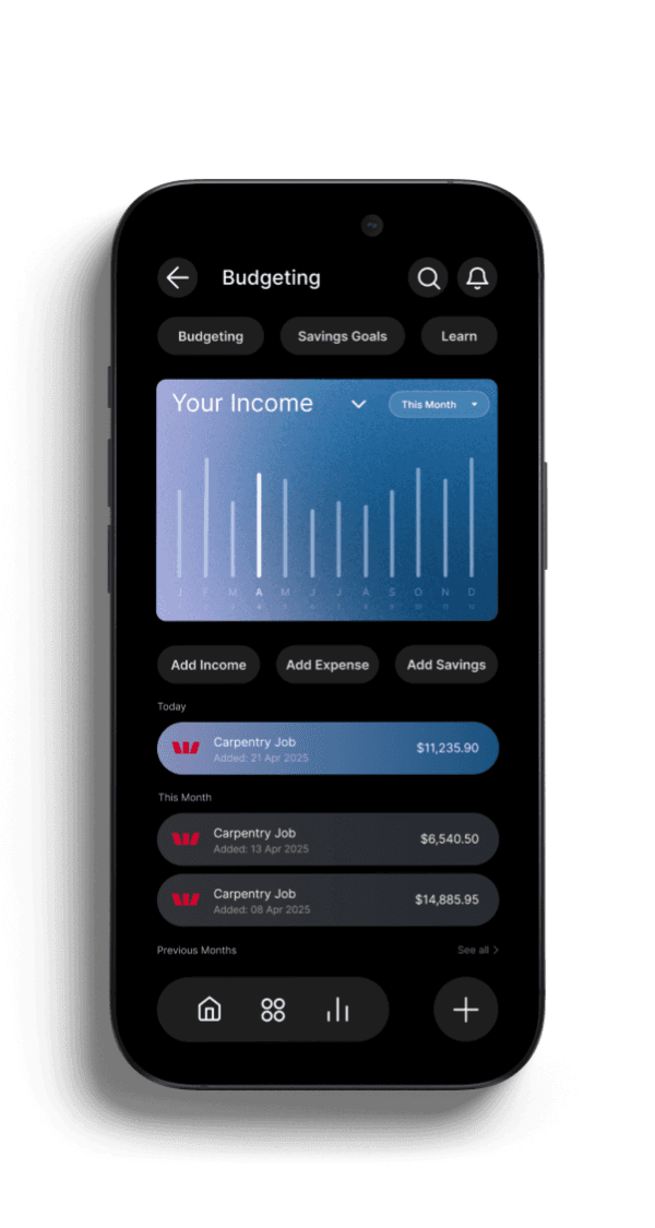
BUDGETING INCOME
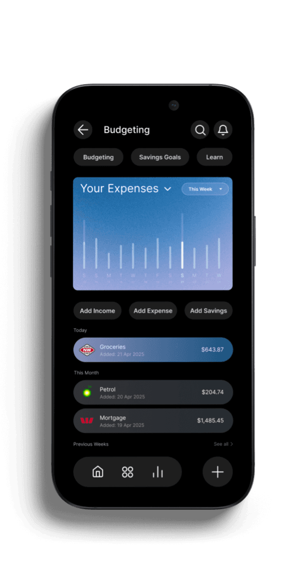
BUDGETING EXPENSES
BUDGETING SAVINGS
FINAL DESIGN /
BUDGETING
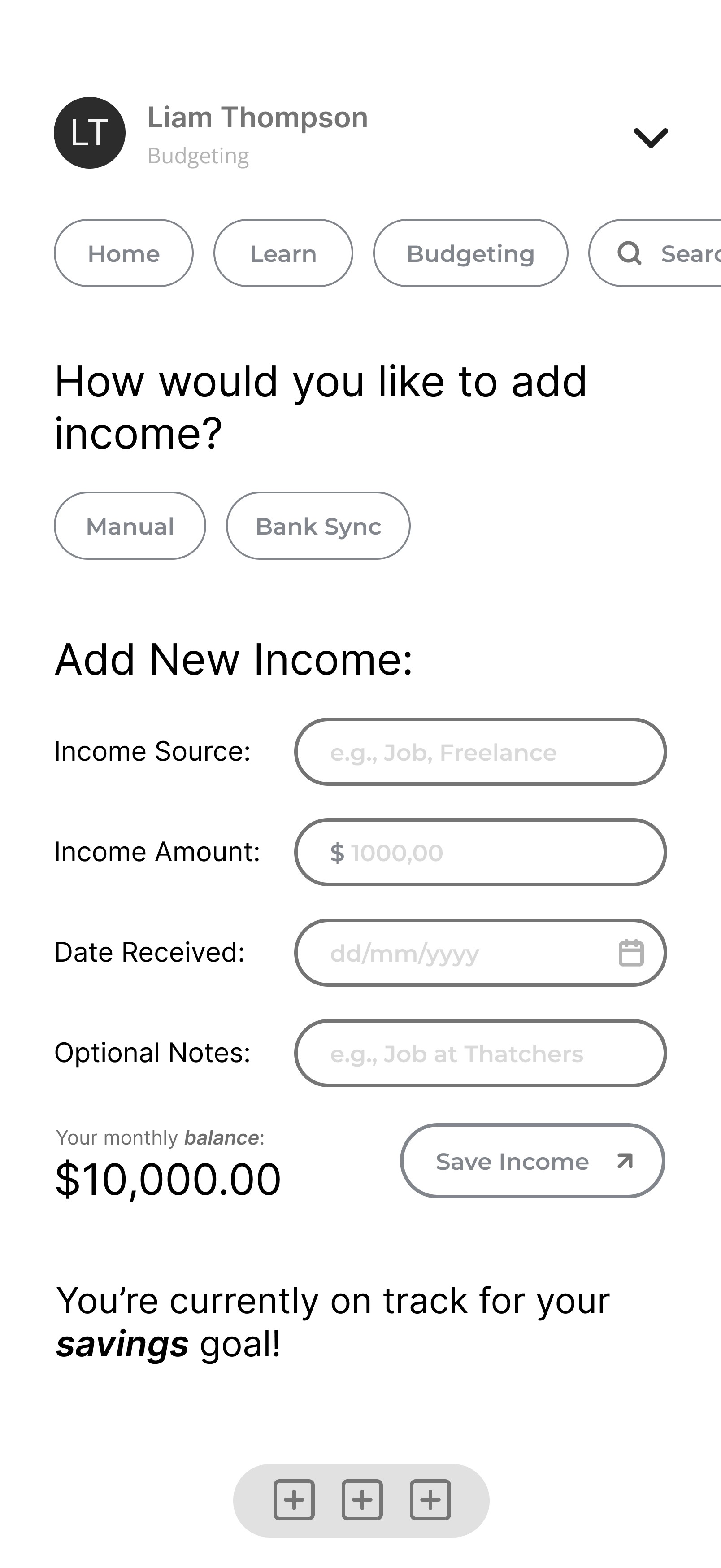
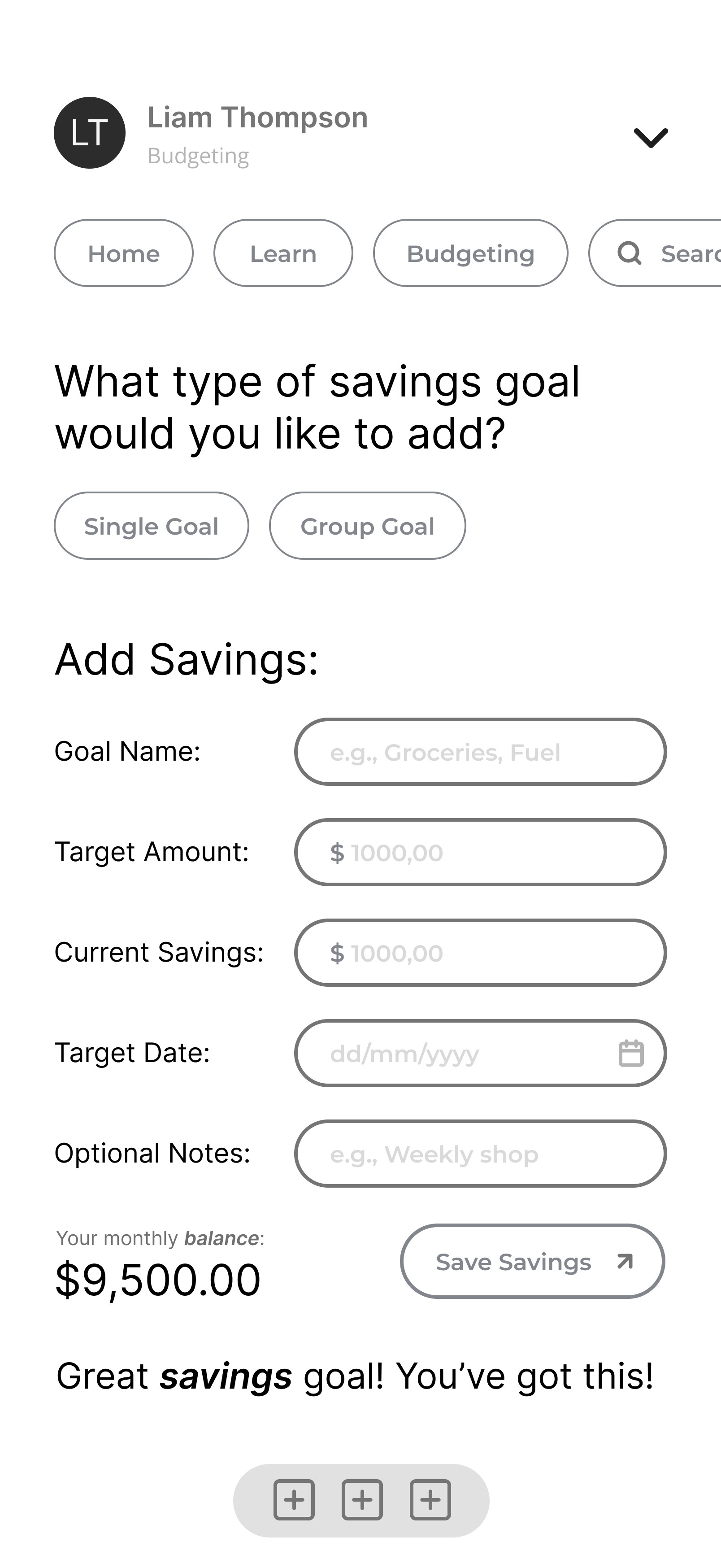
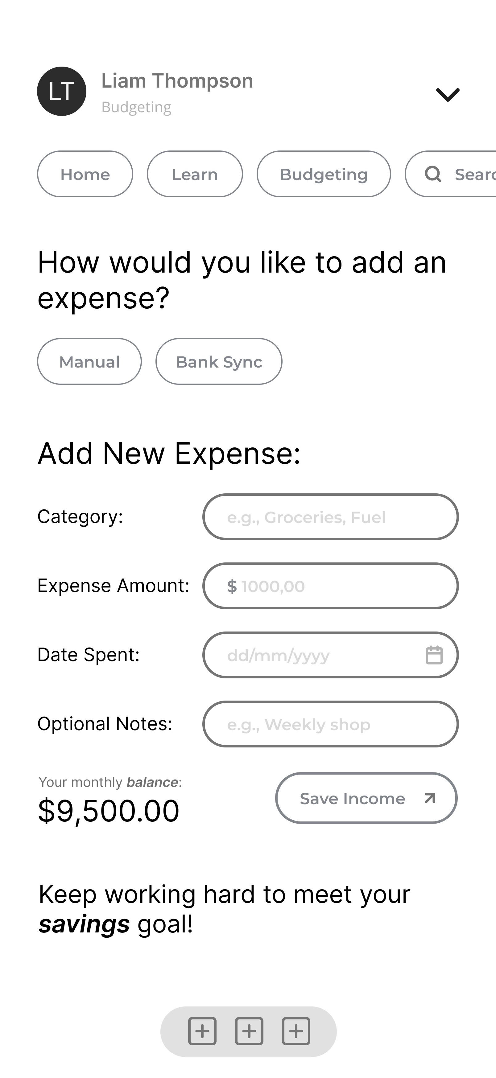
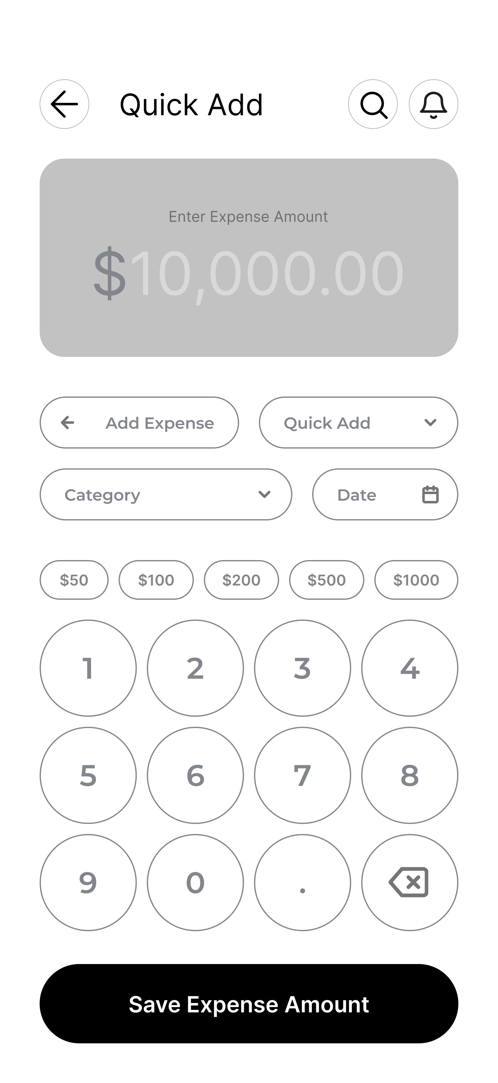
Budgeting input and savings goals.
These input screens were designed around speed and repeat use. Testing showed manual entry felt slow when too many fields were required, so the flows separate detailed setup from quick actions and prioritise the amount first.
Amount-first entry, presets, and a numeric keypad reduce effort, while structured forms remain available for fuller entries. This balance encourages consistent logging without friction.
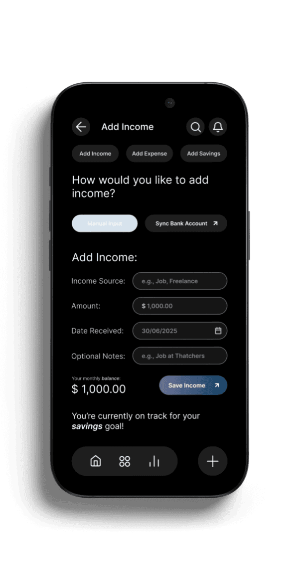
BUDGETING ADD INCOME
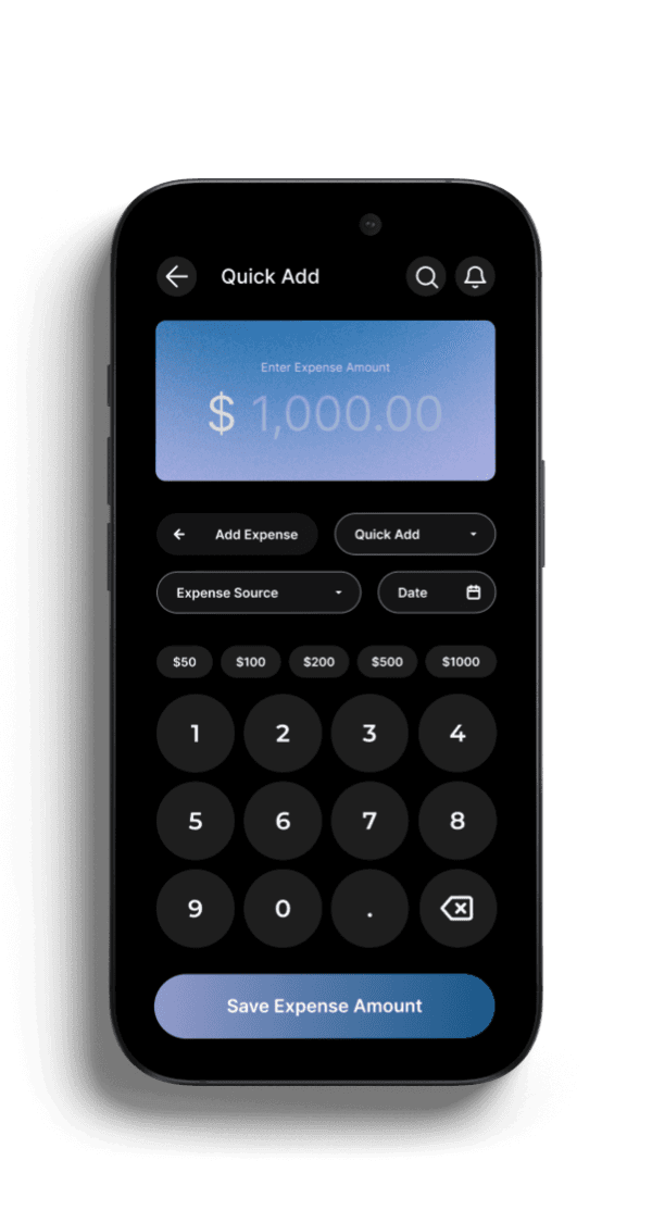
BUDGETING QUICK ADD
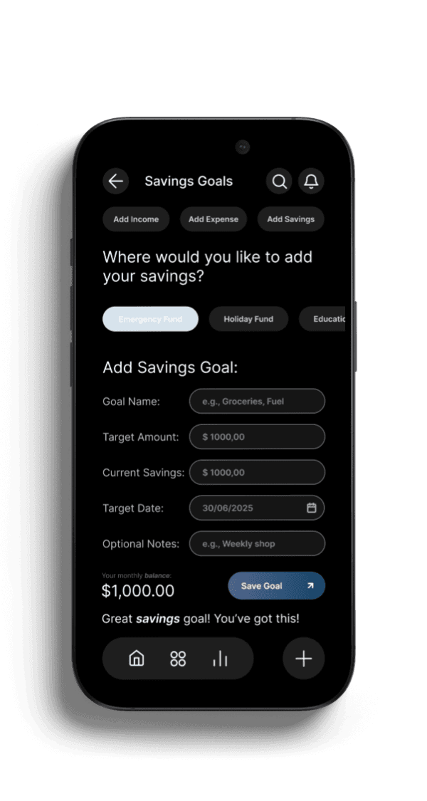
SAVINGS GOALS
FINAL DESIGN /
LANDING SCREENS
Overall experience.
Research showed users felt hesitant to begin, unsure where to start, and frustrated by slow entry.
The flow responds by building familiarity in onboarding, providing orientation through the dashboard, and supporting fast repeat interactions in budgeting, making tracking feel manageable rather than overwhelming.
ONBOARDING
HOMESCREEN DASHBOARD TO BUDGETING
FINAL DESIGN /
FINAL HI-FI PROTOTYPING CORE FLOWS & SCREEN TRANSITIONS
11
REFLECTION & NEXT STEPS
Beyond just a design.
This project reinforced the importance of designing beyond interfaces - focusing instead on behaviour, emotion, and long-term impact.
Building Nest strengthened my ability to translate complex financial problems into calm, usable, and motivating experiences.
What I Learned
+
Next Steps
+
12
CONCLUSION
Nest.
Nest demonstrates my ability to design thoughtful, user-centred products that balance usability, emotion, and visual clarity. Through research, testing, and iteration, I translated complex financial challenges into a calm, approachable experience that supports real behaviour change.
This project reflects my strengths in end-to-end UX design - from problem framing and user research through to high-fidelity execution - and my focus on creating products that are both functional and meaningful.
Involvement.
Led the project end-to-end including research, interaction design, visual design, prototyping, and usability testing.
The goal wasn’t to make people track their money more,
it was to make them worry about it less.